Templates Overview
RadPanelBar items are extremely configurable. In addition to the preset skins, you can customize the appearance of panel items by adding custom images, using CSS classes, or creating custom skins.
If you want to embed HTML or server controls in a panel item, you must use templates. You can embed any content inside a RadPanelItem template, including:
- HTML markup
- ASP.NET server controls
- Other third-party controls (including other Telerik controls)
RadPanelBar supports three base types of item templates—ItemTemplate, ContentTemplate and HeaderTemplate.
In this article you will find information about:
- The behavior of the ItemTemplate.
- The behavior of the ContentTemplate.
- The behavior of the HeaderTemplate.
- The differences between the ItemTemplate and the ContentTemplate, and when you should use them.
- Examples
Read the The differences between the ItemTemplate and the ContentTemplate, and when you should use them section to get a better understanding on when to use which template. In the most common case, you should use the
ContentTemplateof a concrete item to add content to it, unless you want it to have child panel items. Using theItemTemplateor theControlscollection can result in various collapsing issues.
ItemTemplate
The following list explains the key behaviors of the ItemTemplate:
- The
ItemTemplateappears in the panel item immediately below its text. - The
ItemTemplateset for a concrete item will override theItemTemplateset for the entire panel bar. - The
ItemTemplatewill be present in all items even if they have child items, unless:- an item declares its own
ItemTemplate - an item declares its own
ContentTemplate
- an item declares its own
- The
ItemTemplatecan be collapsed or expanded if:- the item has
Textspecified. - the item has
HeaderTemplatespecified.
- the item has
- The
ItemTemplatecannot be collapsed if the item has child items. - The
ItemTemplatewill become the entire item if the item does not haveText,HeaderTemplateor child items.
ContentTemplate
The following list explains the key behaviors of the ContentTemplate:
- The
ContentTemplaterenders as the main body of the item, below the header. - The
ContentTemplatecan be used only together with aHeaderTemplate, you cannot have child items or anItemTemplate. - The
ContentTemplatereplaces anItemTemplateif one is defined for the entire panel bar. - The
ContentTemplatecan be expanded and collapsed as if the item had child items. - If the item does not have
Textor aHeaderTemplate, the item cannot be collapsed or expanded even if it has aContentTemplatedefined.
HeaderTemplate
The following list explains the key behaviors of the HeaderTemplate:
- The
HeaderTemplateacts as the title of the item, you can click it to collapse or expand the item. - The
HeaderTemplatereplaces theText. - Defining a
HeaderTemplateremoves the built-in header UI (coloring, collapse/expand arrow).
Differences Between ContentTemplate and ItemTemplate
Here are the key differences between the two templates:
- The
ContentTemplatedoes not allow child items, while theItemTemplatedoes. - The
ItemTemplatecan be defined globally for all items, theContentTemplateis defined per item. - You can also define an
ItemTemplateper item. - You cannot have both an
ItemTemplateand aContentTemplateon the same item, or an exception will be thrown.
A general guidance on when to use templates:
- If you want to define specific collapsible content for an item, you should use the
ContentTemplateof that item (see Combine ItemTemplate and ContentTemplate). - If you want some content in all items, above their child items, you should use the
ItemTemplate(see Overriding ItemTemplates).
Examples
The examples below can show you how the control behaves.
You can define a global ItemTemplate and change it for a specific item (see Overriding ItemTemplates) or you can simply define your own ContentTemplate for each item where you need special content in addition to the generic content (Combine ItemTemplate and ContentTemplate).
Overriding ItemTemplates
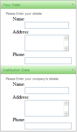
The following example shows a panel bar that uses a global template on child items as a data entry form. The root level items use an item template to override the default template on child items:
For an example of Content Templates, see the PanelBar / Templates demo.
<telerik:RadPanelBar ID="RadPanelBar1" runat="server" RenderMode="Lightweight">
	<Items>
		<telerik:RadPanelItem Text="Your Data" runat="server">
			<ItemTemplate>
				<!-- Empty template to suppress global template -->
			</ItemTemplate>
			<Items>
				<telerik:RadPanelItem runat="server" Text="Please Enter your details:">
				</telerik:RadPanelItem>
			</Items>
		</telerik:RadPanelItem>
		<telerik:RadPanelItem runat="server" Text="Institution Data">
			<ItemTemplate>
				<!-- Empty template to suppress global template -->
			</ItemTemplate>
			<Items>
				<telerik:RadPanelItem runat="server" Text="Please Enter your company's details:">
				</telerik:RadPanelItem>
			</Items>
		</telerik:RadPanelItem>
	</Items>
	<ItemTemplate>
		<div class="module" style="width: 100%; float: left">
			<dl>
				<dt>Name:</dt>
				<dd>
					<asp:TextBox ID="Name" runat="server" Width="140px" />
				</dd>
				<dt>Address:</dt>
				<dd>
					<asp:TextBox TextMode="MultiLine" Columns="20" Rows="3" ID="Address" runat="server" Width="140px" />
				</dd>
				<dt>Phone:</dt>
				<dd>
					<asp:TextBox ID="Phone" runat="server" />
				</dd>
			</dl>
		</div>
	</ItemTemplate>
</telerik:RadPanelBar>
Combine ItemTemplate and ContentTemplate
You can use both templates to create a comples hierarchy with information specific for each item, with child items and with global information. The example below combines different manners of creating items and defining templates so you can see how the control behaves with them.
<telerik:RadPanelBar ID="RadPanelBar1" runat="server" AllowCollapseAllItems="true" ExpandMode="SingleExpandedItem" RenderMode="Lightweight">
	<ItemTemplate>
		I am a global item template and I will be present in all items unless they override
		the ItemTemplate themselves, or they have a ContentTemplate defined.
		I can collapse if my item has Text or a header. The collapsible part of an item is its child items
		or its ContentTemplate.
	</ItemTemplate>
	<Items>
		<%--This item has no text and no Header Template so it cannot be collapsed--%>
		<telerik:RadPanelItem></telerik:RadPanelItem>
	</Items>
</telerik:RadPanelBar>protected void Page_Load(object sender, EventArgs e)
{
RadPanelItem firstItem = new RadPanelItem();
firstItem.Text = "Collapsible item with Text";
RadPanelBar1.Items.Add(firstItem);
RadPanelItem secondItem = new RadPanelItem();
secondItem.Text = string.Format("Click me to expand my child items");
secondItem.Expanded = false;
RadPanelBar1.Items.Add(secondItem);
//create child items and set their templates
for (int i = 1; i < 10; i++)
{
RadPanelItem childItem = new RadPanelItem("child item " + i);
childItem.Expanded = false;
//uncomment this to see how the appearance changes
//childItem.HeaderTemplate = new myContentTemplate(i, "header");
//define a content template with particular details for each item
childItem.ContentTemplate = new myContentTemplate(i, "content");
secondItem.Items.Add(childItem);
}
}
public class myContentTemplate : ITemplate
{
void ITemplate.InstantiateIn(Control container)
{
container.Controls.Add(new LiteralControl(string.Format("{0} template for {1}", myType, idx)));
}
private int idx { get; set; }
private string myType { get; set; }
public myContentTemplate(int index, string type)
{
this.idx = index;
this.myType = type;
}
}