New to Telerik UI for ASP.NET AJAX? Start a free 30-day trial
RadDropDownList Structure
Updated over 6 months ago
The structure of the RadDropDownList control is as follows:
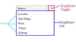
The top of the control has an area, which displays the selected item of the default message if no item is selected. Next is a drop-down toggle, which controls whether the Drop-down list is visible. The drop-down list contains a collection of items, from which the user can choose.
The asociated markup code
ASPNET
<telerik:RadDropDownList RenderMode="Lightweight" ID="RadDropDownList1" runat="server" DefaultMessage="Select.." DropDownHeight="110px" >
	<Items>
		<telerik:DropDownListItem Text="London" />
		<telerik:DropDownListItem Text="San Diego" />
		<telerik:DropDownListItem Text="Paris" />
		<telerik:DropDownListItem Text="Tokyo" />
		<telerik:DropDownListItem Text="Sydney" />
	</Items>
</telerik:RadDropDownList>