
KendoReact
What's New R1 2021
What's New HistoryWhat's New R1 2021
What's New HistoryNew Component: React TileLayout
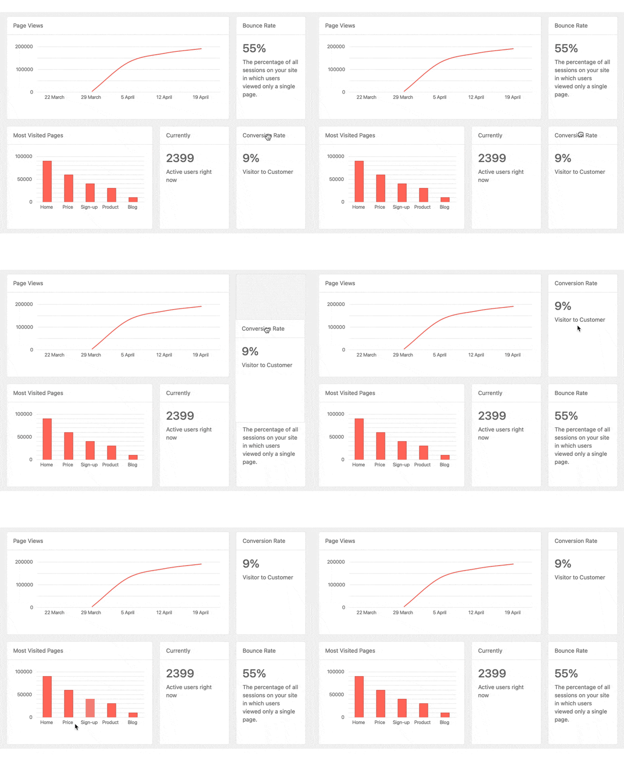
The new KendoReact TileLayout component is perfect for creating interactive dashboards using a single UI component with a flexible set of configuration options. Simply define some grid-like metrics (rows and columns) along with a collection of tiles and their dimensions and you're off to the races. It features draggable and resizable tiles, static ones, various auto flows and more. What’s more, each tile is completely customizable, which means you can build stunning and interactive layouts with this new React component.
See React TileLayout demo
New Component: React DropDownTree
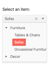
One of the most requested form components over the last few releases has been a combination of a TreeView and a DropDown component, which led to the new KendoReact DropDownTree.
The React DropDownTree component is perfect for forms that need to be concise while still offer an advanced data structure to select an item from. When users interact with this simple input element, the dropdown opens up to reveal a built-in TreeView with a hierarchical structure. Users can then pick a node and the selected value will appear in the input of the component.
See React DropDownTree demo
New Component: React Multi-Column ComboBox
Adding to the list of popular dropdowns we added in R1 2020, we also have the new KendoReact Multi-Column ComboBox. This React UI component takes a dropdown and provides a table structure for each item. Items are still shown as a list, but each item can display multiple fields per row, giving that classic table look and feel. Once a user selects an item, a single value will be displayed in the input. The Multi-Column ComboBox comes with filtering, grouping, virtualization and more handy features.
See React Multi-Column ComboBox demo

New Component: React FloatingActionButton
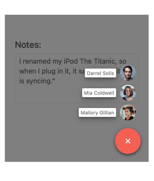
Used in many modern web and mobile applications alike, the FloatingActionButton provides a permanent action button that appears to be floating above existing content. This button is usually responsible for a single action, often contextual to the current page. A popular example is the "Compose" button in Gmail and other email clients.
The look-and-feel of the component can be customized to make sure the button fits your overall design. Additionally, this React FloatingActionButton can feature a "speed dial" set of buttons which will animate out of the main button and provide multiple action buttons to select from.
See React FloatingActionButton demo
New Component: React Bottom Navigation
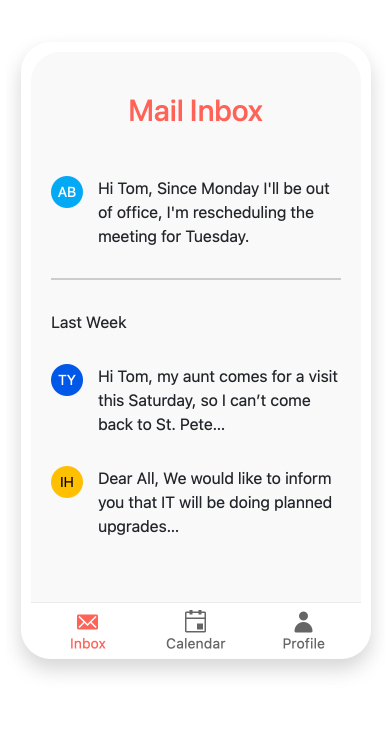
Тhe new React BottomNavigation component is the perfect navigation UI element for responsive web and mobile applications. The KendoReact BottomNavigation easily integrates with any routing library, making navigating between views a simple task. Each navigation
item within the component features an icon and associated text to ensure that end-users have the full context around what each navigation will provide. Naturally, this component is responsive and will respond to any changes in the size of the viewport.
See React BottomNavigation demo
New Component: React ListBox
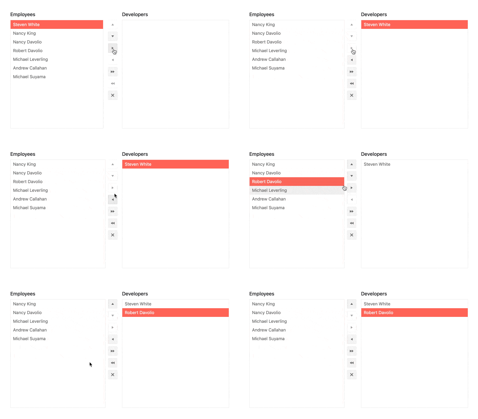
Another highly requested component is the new React ListBox. It provides an interface for displaying a list of items in a defined area that can be scrolled through and allows selecting, reordering, deleting, and dragging and dropping of items. Additionally, several KendoReact ListBoxes can be combined in order to enable users to move items between lists. When dealing with multiple ListBoxes you also have the option to add buttons that render between the boxes to help manage moving single, or multiple, item(s) between the various ListBox instances.
See React ListBox demo
New Components: React Icon & SvgIcon
With R1 2021, we are also introducing the React Icon and React SVGIcon components. The names give it away: these UI components are responsible for displaying icons within your application. The big difference between the two is that the KendoReact Icon component displays icons as font icons, while the SVGIcon renders all its icons as SVG elements.
When you add these React UI components to your application, you have access to over 400 integrated icons from KendoReact so chances are you'll find the perfect icon to use for any scenario.
See React Icon and React SVGIcon demos
React 17 Support
On the official launch day of React 17, the KendoReact team announced day zero support for React 17 in all KendoReact UI components. This happened a little after our last release webinar, back in October, so we wanted to reiterate that you can always reply on KendoReact to stay up-to-date with the latest and greatest technology.

React Data Grid Improvements: Built-In Keyboard Navigation
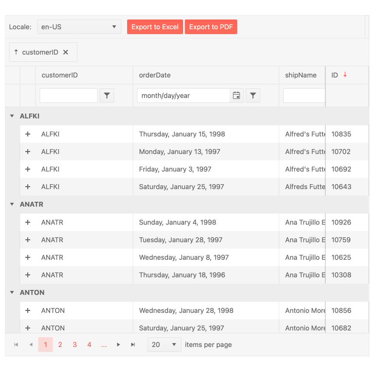
While the KendoReact Grid has supported keyboard navigation for a long time, we had left it to the developer to decide how to configure this feature—for example, to define what happens when you hit the “Tab”.
While this gives flexibility, it also adds complexity since developers have to think about how keyboard navigation should work for them. So, with R1 2021, we have added built-in and opinionated ways for handling keyboard navigation within the React DataGrid to help alleviate this complexity and let developers use a simple set of configuration options.
See React Data Grid demo: Keyboard Navigation
React Data Grid Improvements: Improved Performance in Data Cells State Management
Performance is of ultimate importance for any data grid. With the goal to offer nothing but the best to KendoReact users, we did a deep-dive into the KendoReact Grid and further optimized how state management is done on the cell level. Since cells are the building blocks of any data grid, improving the performance of an individual cell can have a huge impact across any data grid – which is what this update brings.
See React Data Grid demo

React TreeList Improvements: Built-in Keyboard Navigation
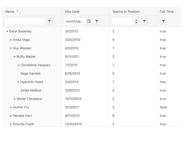
Like the same Grid improvement mentioned earlier, with R1 2021, the KendoReact TreeList component has taken a step toward making keyboard navigation simpler for developers to implement. While you can still take full control over exactly how keyboard navigation is handled, now you can also enable a base-level keyboard navigation that handles interactions for you through a few configuration options.
See React TreeList demo: Keyboard Navigation
React Gantt Improvements: Built-in Keyboard Navigation
The KendoReact Gantt also received built-in keyboard navigation with R1 2021. This is important to ensure that the Gantt can pass accessibility compliance reviews. Moreover, it is now far easier to add keyboard navigation, compared to taking full control yourself (which is still possible, of course).
See React Gantt demo: Keyboard Navigation
React Gantt Improvements: Editing
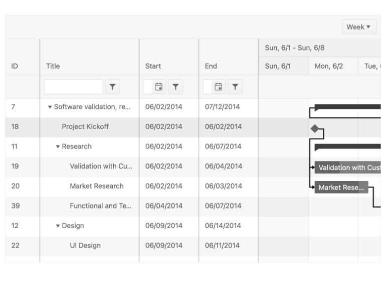
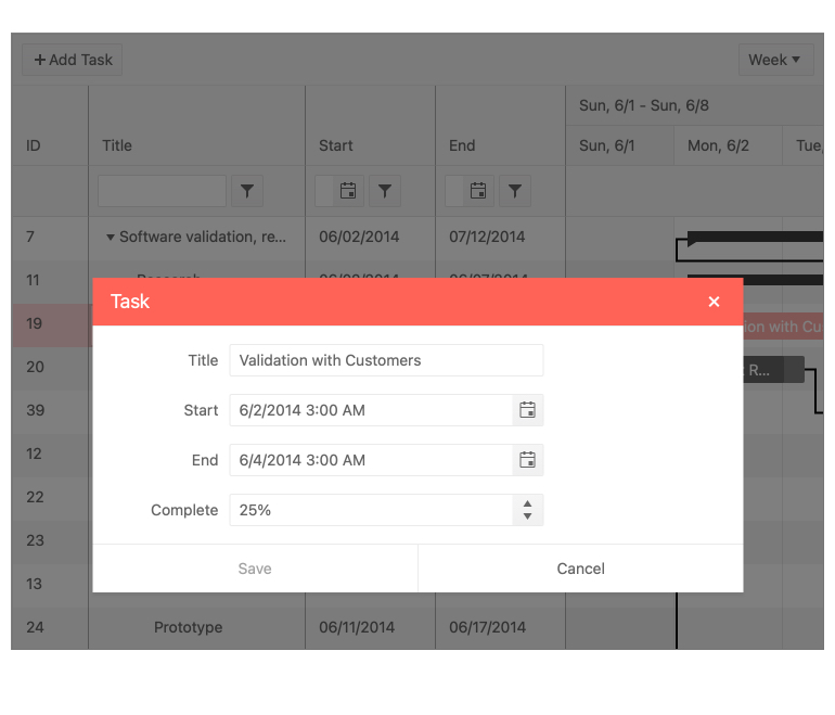
Another React Gantt update is the added built-in editing functionality - a major feature that many Gantt users will be looking for. It can help end-users with modifying and updating tasks found within the Gantt.
See React Gantt demo: Editing
React Editor Improvements: Keyboard Navigation
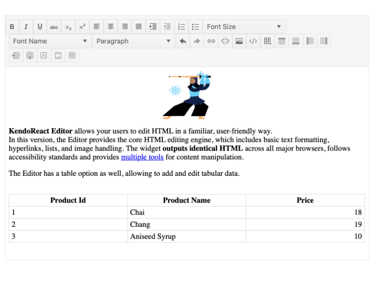
To round up the keyboard navigation improvements in R1 2021, the KendoReact Editor also added a built-in option for keyboard navigation that removes the need to define your own keyboard operations with the Editor component. Just like with the other components, enabling keyboard navigation in this way ensures you will meet your accessibility goals.
React Avatar Improvements: New Options and Updated Design
With R1 2021, the KendoReact Avatar component received several updates to its design as well as configuration options to help control the look and feel. Without going in to the nitty and gritty details, this update provides React developers with even more flexibility when it comes to customizing the appearance of the React Avatar component.
See React Avatar demo: New Options, Updated Design
React Scheduler Improvements: Custom Form and Form Editor
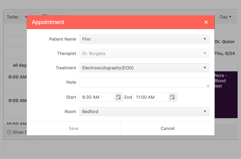
Editing has existed within the KendoReact Scheduler for quite some time, but the form responsible for editing any event was a default form that could not be customized. This has now changed with R1 2021! With the new Custom Form and Form Editor feature, React developers can pass a custom component to be responsible for the editing of the Scheduler, giving yet another way to make the Scheduler fit any design requirements.
See React Scheduler demo: Custom Form Editor
React Scheduler Improvements: Current Time Marker
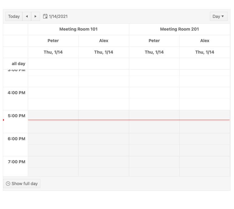
The KendoReact Scheduler component received another new feature: current time marker. It provides an indicator that is constantly displayed within the calendar interface and shows your current time over the available events. This feature makes it much easier for end-users to know what events they have scheduled and what the current time is without having to cross-reference their clock.
See the React Scheduler demo: Current Time Marker
KendoReact - R1 2021
- New Component: React TileLayout
- New Component: React DropDownTree
- New Component: React Multi-Column ComboBox
- New Component: React FloatingActionButton
- New Component: React Bottom Navigation
- New Component: React ListBox
- New Components: React Icon & SvgIcon
- React 17 Support
- React Data Grid Improvements: Built-In Keyboard Navigation
- React Data Grid Improvements: Improved Performance in Data Cells State Management
- React TreeList Improvements: Built-in Keyboard Navigation
- React Gantt Improvements: Built-in Keyboard Navigation
- React Gantt Improvements: Editing
- React Editor Improvements: Keyboard Navigation
- React Avatar Improvements: New Options and Updated Design
- React Scheduler Improvements: Custom Form and Form Editor
- React Scheduler Improvements: Current Time Marker

