Kendo UI for jQuery
What's New R1 2023
What's New HistoryVarious jQuery Components: Built-in Floating Label Support
Floating labels are part of standard modern UI design elements for inputs. They give the user a prompt by placing the label text in the field. When a user clicks to interact, the label will move to an outside position. Many of our jQuery input components already have them and we have added them to the list below.
- DropDownList
- ComboBox
- MultiSelect
- AutoComplete
- DropDownTree
- MultiColumnComboBox
- DateInput
- DatePicker
- DateTimePicker
- TimePicker

Various jQuery Components: Improved CSP Compliance
Content Security Policy (CSP) is a standard that browsers use to prevent cross-site scripting and other attacks. With this release, we have made two important changes to the source code to ensure compliance. First, we replaced the “eval” and “new Function” source code with compliant functions. Second, we reworked the Kendo UI Template to be more compliant.
See the jQuery Content Security Policy

New Component: jQuery TimeDurationPicker
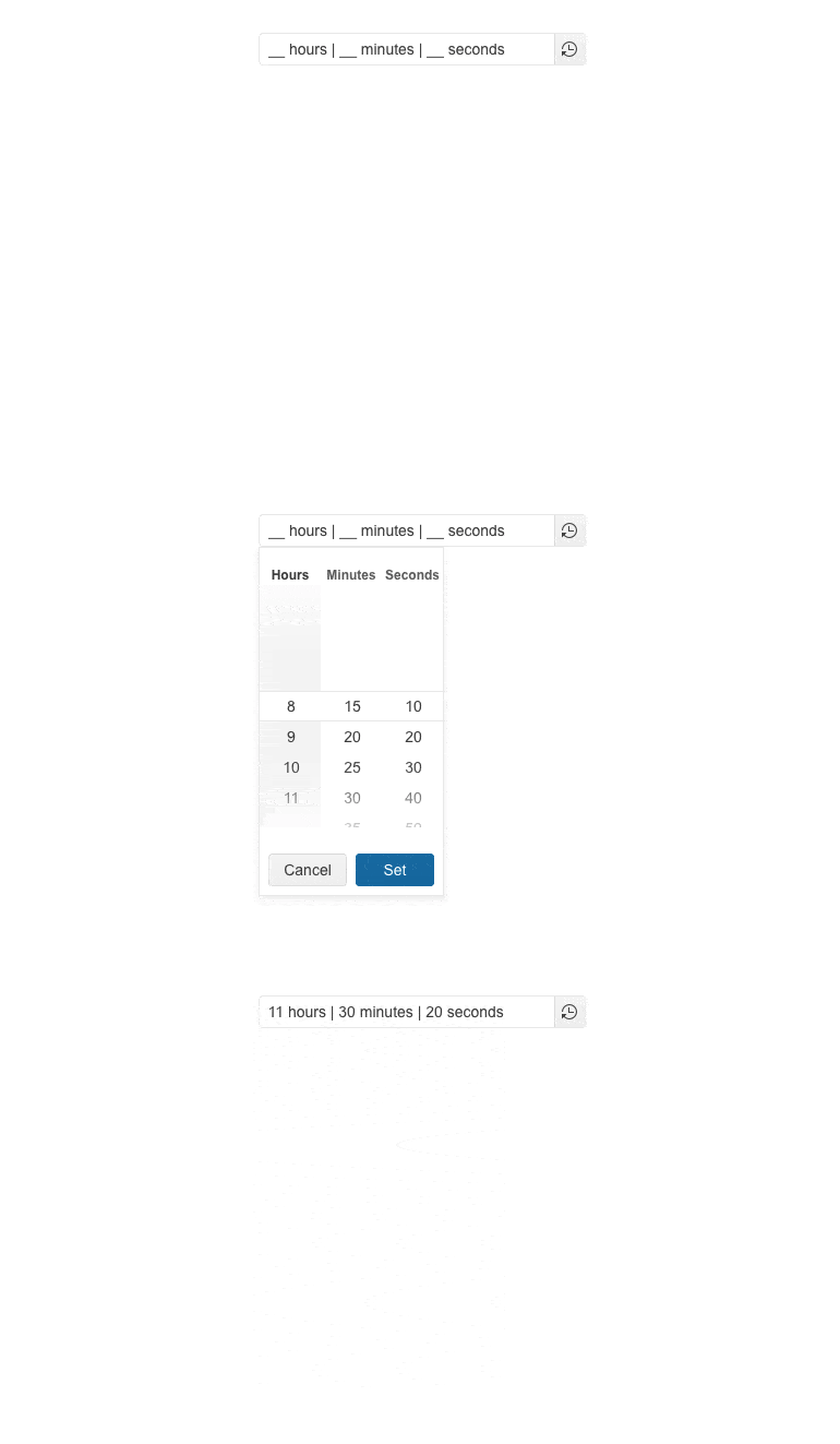
The jQuery TimeDurationPicker component enables users to select a particular time duration, without the necessity to provide a specific date, range of dates or time slot. Instead, they are empowered to determine how many days, hours, minutes, or seconds an activity (e.g., online session, event, work project, etc.) is expected to take. Users can either type the desired time duration or pick a value from the component popup with built-in shortcut values.
See the jQuery TimeDurationPicker Component demo

jQuery Chart Enhancement: Subtitle Property
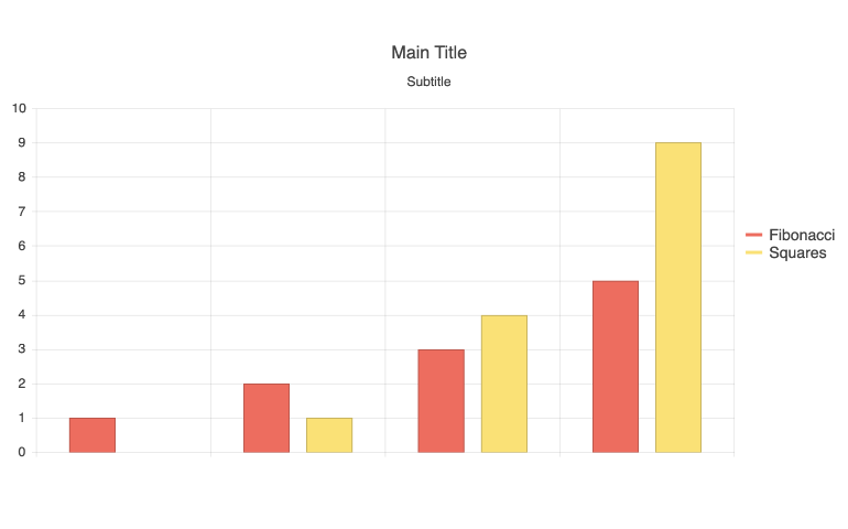
A subtitle property has been added to all jQuery Charts in order to make it easy to add text under the main title element.
See the jQuery Charts Subtitle Property documentation

jQuery Bullet Charts Enhancement: Label Support
You can now set a simple property to display labels in the jQuery Bullet Chart to give users more context to what they are looking for.
See the jQuery Bullet Chart demo

All jQuery Components: ECMAScript (ES) Module Support
We have modernized Kendo UI for jQuery to support ES modules. You are no longer required to use AMD modules and can choose ES. For
New Component: jQuery ChipList
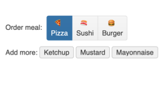
The jQuery ChipList is a companion to the jQuery Chip and provides a container and functionality for managing a collection of Chips.

New Component: jQuery Chip
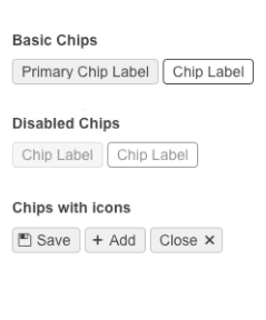
The jQuery Chip component enables you to add compact containers, often referred to as "pills", to your projects. This component is responsible for a single "pill" and can contain text, an image or avatar (optional), and a built-in icon, such as an "X," to indicate that an action can be taken. The Chip can be used on its own or as part of other components to showcase unique values that have been selected by the user. This is often used in selecting tags for a blog post or recipients of a message.

Kendo UI for jQuery - R1 2023
- Various jQuery Components: Built-in Floating Label Support
- Various jQuery Components: Improved CSP Compliance
- New Component: jQuery TimeDurationPicker
- jQuery Chart Enhancement: Subtitle Property
- jQuery Bullet Charts Enhancement: Label Support
- All jQuery Components: ECMAScript (ES) Module Support
- New Component: jQuery ChipList
- New Component: jQuery Chip


