
Kendo UI for Angular
Angular Scheduler
- Embed a full-featured, best-in-class Outlook-style calendar into any Angular application.
- Part of the Kendo UI for Angular library along with 110+ professionally-designed components.
- Includes support, documentation, demos, virtual classrooms, Visual Studio Code Extensions and more!
-
Full-Featured Calendar to Add Scheduling to Your Angular Apps
The Kendo UI for Angular Scheduler component offers an in-app calendar experience similar to Outlook or Google Calendar. The Angular Scheduler has several essential features such as multiple calendar views, support for multiple resources, editing of events through a form or by dragging and resizing, time zone conversions, and more. Every feature can be enabled through a single configuration option or customized with a flexible API.
-
Events
Events are the main way users interact with the Kendo UI for Angular Scheduler. Each event can be created through a built-in form by double-clicking in the Scheduler or even added through an external form. Additionally, rendered events can be edited, resized to indicate a new duration, or dragged and dropped to be displayed in a different day.
See Angular Scheduler Events demo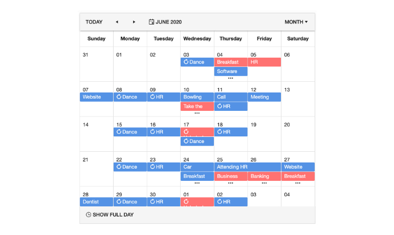
-
Editing
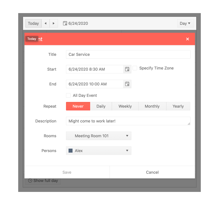
The Kendo UI for Angular Scheduler enables users to edit single or recurring events. Editing can be done through keyboard navigation or by double-clicking with the mouse on an event. The Angular Scheduler provides a built-in form that contains all fields tied to a particular event, all out of the box.
-
Resources
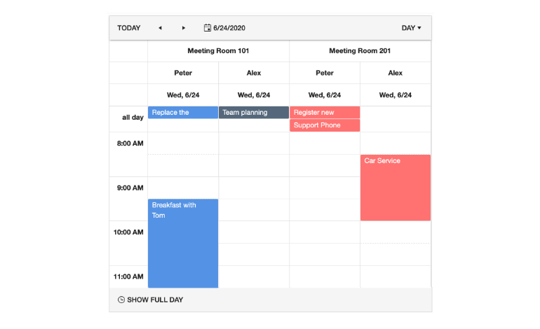
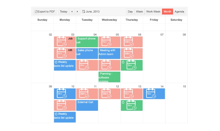
When multiple individuals, rooms, or other unique resources need to be categorized and rendered differently within the Kendo UI for Angular Scheduler, the Resources feature is critical. This feature allows every event to be tied to a specific resource, automatically giving users a unique look-and-feel to these events.
-
Recurrence
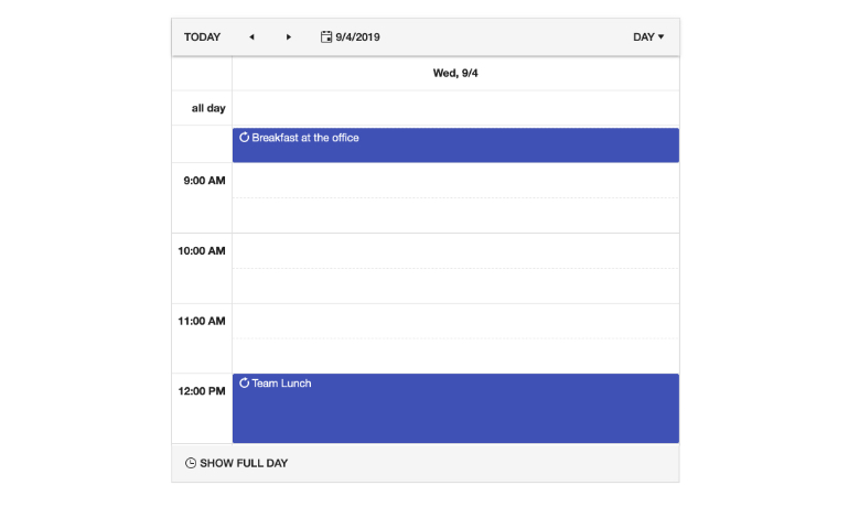
The Kendo UI for Angular Scheduler has a recurrence editor built in. This means events can be configured to occur on a daily, weekly, monthly, and even annual basis. Additionally, the recurrence editor is sophisticated enough to contain logic for exceptions to the recurrence rules, giving users a huge range of flexibility for defining recurring events.
-
Time Zones
By default, the Kendo UI for Angular Scheduler component will utilize the local time zone of the user’s browser to display events in the scheduler. However, you have the option to set a fixed time zone across all users.
-
Agenda View
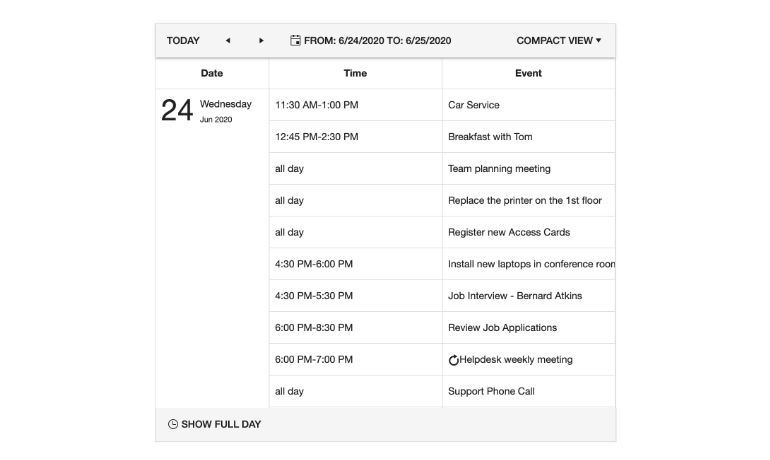
Agenda view is often found in mobile scheduling applications. The Agenda View of the Kendo UI for Angular Scheduler shows users a compact overview of all upcoming events. Each event in the Angular Scheduler is an agenda item, and users can horizontally scroll through multiple days and events.
-
Day View
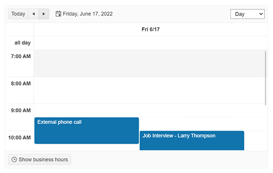
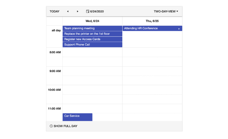
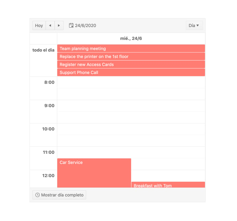
The Day View of the Kendo UI for Angular Scheduler showcases all events in a single day. Users can set the Day View to show the full 24 hours or only their custom work hours to limit the number of available time slots. Additionally, All-Day events are displayed in a dedicated area at the top of the day.
-
Month View
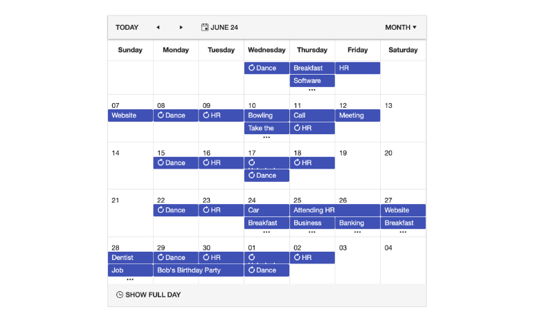
The Month View of the Kendo UI for Angular Scheduler showcases all the days in a month and their corresponding events, organized by weeks. Each day highlights one event alongside a visual cue for multiple events, prompting the user to expand the day view to be able to see all the events scheduled for that day.
-
Multi-Week View
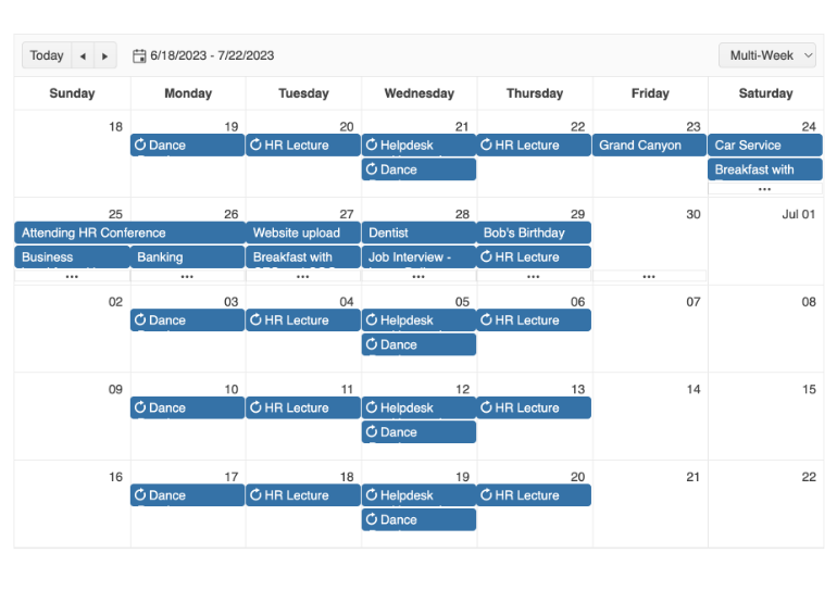
To give you and your users ultimate flexibility, the Angular Scheduler’s Muti-Week View feature allows you to set a custom set of weeks to display. This is similar to the Month view except you can set the start date. Once set, the week of that date plus three more weeks will be presented.
-
Year View
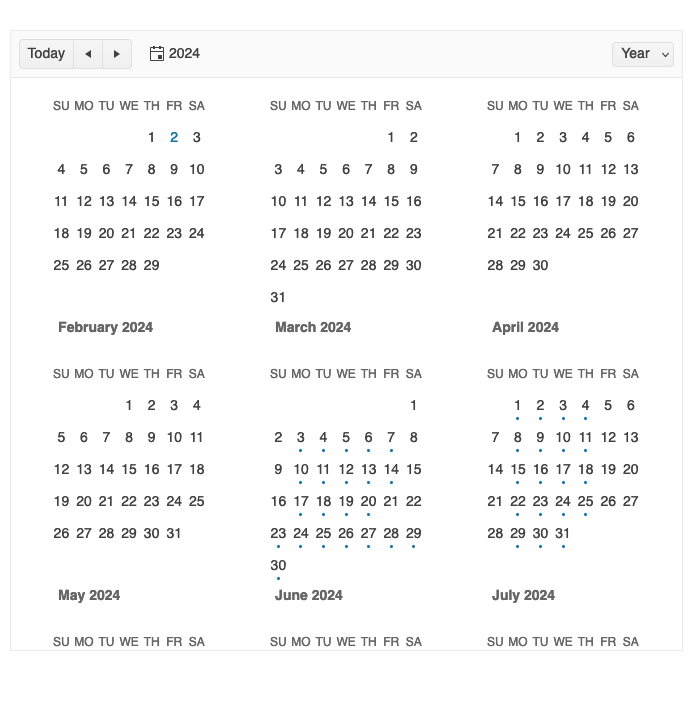
The Kendo UI for Angular Scheduler Year View enables you to conveniently display the events in a twelve-month period.
-
Timeline View
The Timeline View of the Kendo UI for Angular Scheduler focused on a horizontal scroll versus the traditional vertical scroll to give users a different way to see the scheduled events.

-
Week and Workweek Views
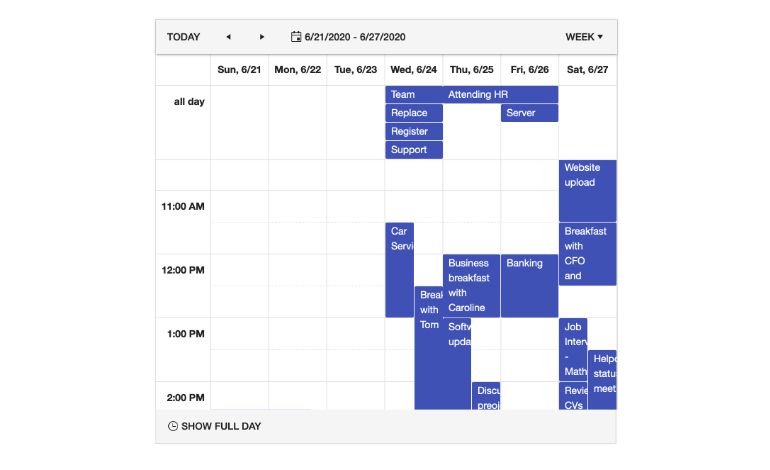
With the Week View of the Kendo UI for Angular Scheduler, users can see all events available in a single week. They can customize the start and end days of the week or use the default Angular Scheduler workweek view, which displays Monday through Friday.
-
Drag and Drop Scheduling
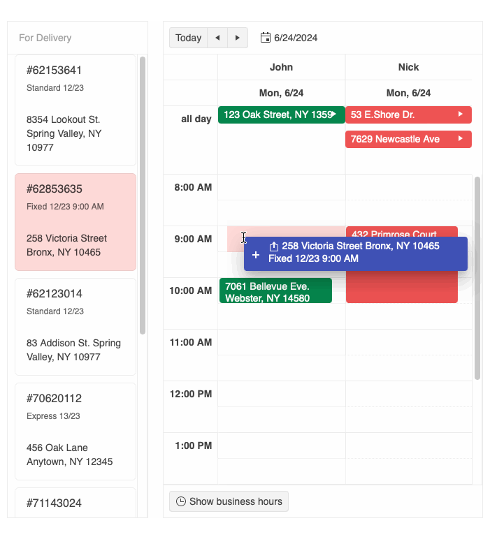
The drag and drop scheduling capability enables users to seamlessly create new scheduler events by dragging items from external UI components and dropping them into a selected time slot.
-
Styling
Easily customize the appearance of the Scheduler events and slots with functional callbacks. You can also style a specific view by adding custom CSS classes or styles to the events and slots withing the specific view.
See the Angular Scheduler Styling demo
-
Highlight Events in Real Time
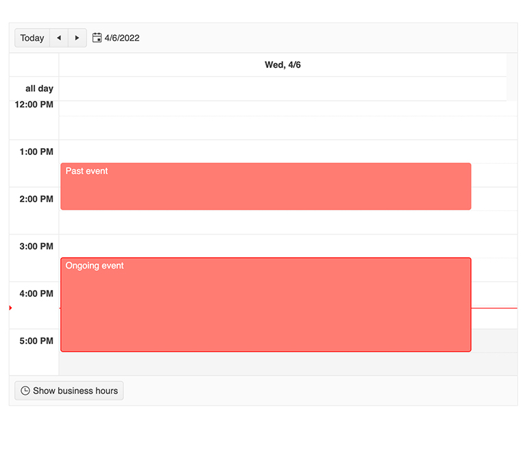
Help users easily spot an event that is currently happening by highlighting it. With this feature enabled any event that falls on the current time will automatically have a highlight style to it. By default, the Angular Schedule will use the built-in theme highlight style, but you can customize it to your requirements.
-
Data Binding
The Kendo UI for Angular Scheduler is a complex component with a built-in engine to help you handle all available events, time zones and other functionality of the component. For this to be seamless, certain fields are required from any data bound to the Angular Scheduler. Rather than require a strict set if field names, the Angular Scheduler allows developers to bind to any object by defining what fields on the custom data model is responsible for the required fields in the Angular Scheduler. This means there is no need to create a new object to bind specifically to the Angular Scheduler.
-
PDF Export
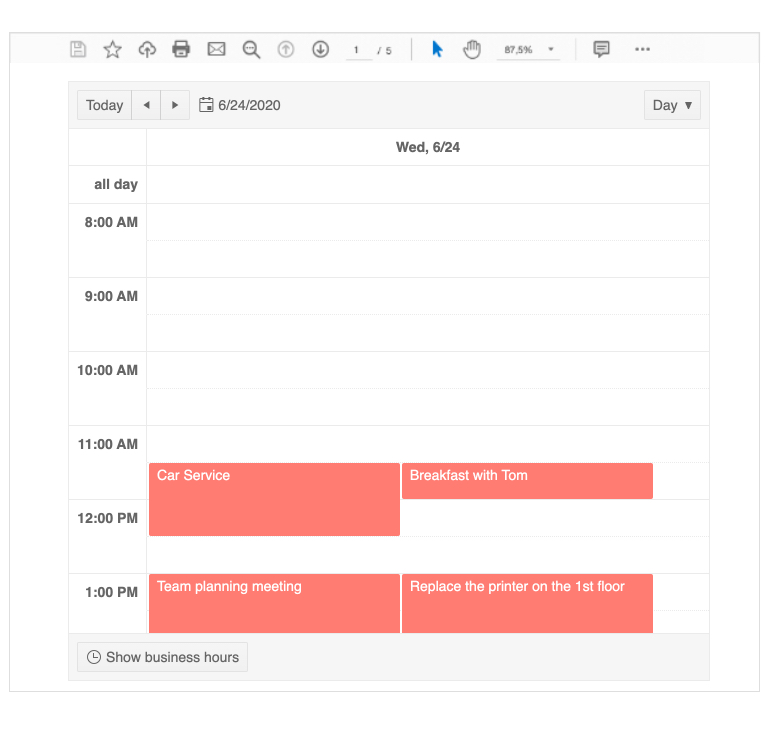
With a single button click the entire content of the Kendo UI for Angular Scheduler can be exported to a PDF file. Thanks to integration with the Kendo UI for Angular PDF Export component, the exported PDF file can be customized to fit any requirements.
-
Templates
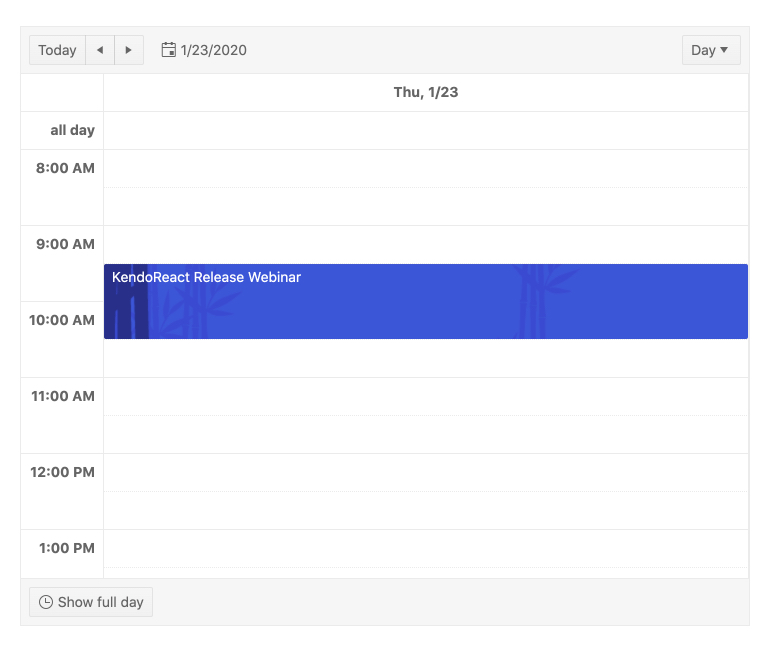
You can completely customize the look and feel of both single and all-day events in the Kendo UI for Angular Scheduler with our rich collection of Angular templates.
-
Globalization
The Kendo UI for Angular Scheduler offers the ability for developers to customize any built-in message of the Angular Scheduler, and the component can also be rendered in a RTL (right-to-left) mode. This ensures that the Angular Scheduler can adapt to any user's locale settings.
-
Keyboard Navigation
The Kendo UI for Angular Scheduler component provides keyboard navigation out-of-the-box. This helps users navigate through, manipulate, and interact with any element of the Scheduler by using their keyboard.

-
Accessibility
The Kendo UI for Angular Scheduler is compliant with Section 508 and WAI-ARIA standards and is AAA rated with WCAG 2.0.

-
Also Available...
The Scheduler component is also available for these popular Web frameworks:
Frequently Asked Questions
-
Why should you choose the Kendo UI for Angular Scheduler (Event Calendar)?
- All Kendo UI for Angular components are built from the ground up for Angular. Many others are wrappers around jQuery or other technologies.
- The component is highly customizable and can be easily modified to suit your needs.
- It is one of over 100 other components in our Angular components library that developers use to build modern, consistent UI.
- As a commercial product, it is frequently updated for Angular compatibility and user demand by a full-time team of experts.
- Our support team consistently wins accolades from industry organizations and users themselves.
- Each feature is meticulously documented.
-
What is the difference between an Angular Scheduler and Event Calendar?
There is no difference. Tools like the Angular Scheduler is sometimes called event calendar. It is sometimes called a calendar or an appointment scheduler as well.
-
How can I try the Kendo UI for Angular Scheduler (Event Calendar)?
You can try all Kendo UI for Angular Components by signing up for a 30-day trial. During your evaluation, you will have access to all the components, technical support, documentation and on-demand technical training.
See the Angular Scheduler Getting Started article for a quick tutorial. Also, don’t forget to sign up for a trial of the Kendo UI for Angular components library to get free support.
-
Where can I buy the Kendo UI for Angular Scheduler (Event Calendar)?
The Angular Scheduler component is one of over 100 in the Kendo UI for Angular components library which is part of the Kendo UI bundle. Kendo UI includes libraries for jQuery, Angular, React, and Vue. You can purchase Kendo UI online or by contacting sales.
You can also choose to purchase DevCraft, which bundles all our .NET and JavaScript components.
-
How do I get started with the Kendo UI for Angular Scheduler (Event Calendar)?
Getting started is easy. Visit the Angular Scheduler Getting Started tutorial for an easy step-by-step tutorial. All you need to do is install the NPM package, add the component to a page, and set desired properties!
Don’t forget to sign up for a trial of the Kendo UI for Angular components library. This gives you a 30-day license and access to support resources to help you during your learning and evaluation process.
-
I don’t need scheduling capabilities. I just want a date picker. Is that available?
Yes. The Kendo UI for Angular components library includes many date input components including various date pickers and a basic calendar.
All Kendo UI for Angular Components
Charts
- Area Chart
- Bar Chart
- Box Plot
- Bubble Chart
- Bullet Chart
- Chart Wizard New
- Charts Updated
- Donut Chart
- Funnel Chart
- Heatmap
- Line Chart
- Pie Chart
- Polar Chart
- Pyramid Chart
- Radar Chart
- Range Area Chart
- Sankey Diagram New
- Scatter Chart
- Sparkline
- Waterfall Chart
Editor
TreeList
Scheduler
Progress Bars
Buttons
Common Features
Conversational UI
Indicators
Diagrams and Maps
Date Inputs
Dialogs
Labels
Icons
Design
Navigation
Dropdowns
- AutoComplete Updated
- ComboBox Updated
- DropDownList
- DropDownTree
- MultiColumnComboBox Updated
- MultiSelect Updated
- MultiSelectTree
Gauges
Grids
Upload
Inputs
- Checkbox
- ColorGradient
- ColorPalette
- ColorPicker
- FlatColorPicker
- FormField
- MaskedTextBox Updated
- NumericTextBox Updated
- RadioButton
- RangeSlider
- Rating New
- Signature
- Slider
- Switch
- TextArea
- TextBox
- TreeView
Bar & QR Codes
Data Tools

Get Started with Kendo UI for Angular
