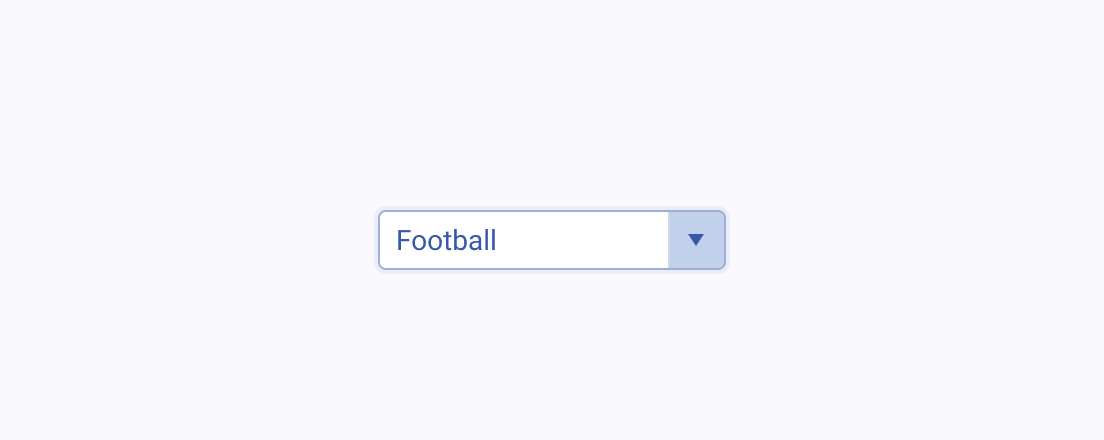
Usage Guidelines
The Telerik and Kendo UI ComboBox requires you to follow some basic principles when using the component.
Number of Options
The text input feature of the ComboBox allows users to enter a custom value that serves as a filter and helps them select an option from a long list. If you need to provide fewer options to the user, consider using a picker or radio buttons.


Item Content
Consider the width of the ComboBox and keep the names of the options short and compact so that they fit. Long item names that occupy multiple lines are hard to perceive and must be avoided.


Label
The label of the ComboBox provides a clear and concise description of the component's purpose, making it easier for users to interact with the interface and understand it. Always display a label unless the ComboBox is next to another component that has a label. The label of the ComboBox can be set as part of the Telerik and Kendo UI Form component.


