
Improve Angular Performance with Lazy Loading, @defer and Kendo UI
 by Dany Paredes

Summarize with AI:
We can leverage lazy loading and @defer with some powerful Kendo UI for Angular components to indicate a page is loading, for a better UX.
When developing our application, we often focus solely on implementing new features and pages without paying enough attention to performance. For instance, we might create pages like Home and Products with a list of products, and while they seem to work fine, have we considered their performance implications?
As our application grows with more pages and sections, the impact on performance becomes more significant if we don’t understand how Angular handles the final bundle.
So, how does it work? The Angular builder gathers all components and bundles them into a single file. This means Angular sends the complete bundle, including all components, to the client whether or not the user navigates to that specific page. It’s akin to bringing out a full-course meal before the user has looked at the menu. 😟
Today, we’re going to explore a few techniques to improve performance and enhance the user experience using Angular features in combination with Kendo UI. As always, the best way to learn is by applying these concepts in a real-world scenario.
This article references code from other articles showcasing interesting features of Angular 17, such as Moduleless and Using RxJS and Signals, where you can discover some amazing features of Angular 17.
Scenario
You have been hired as a frontend developer to continue the Kendo Store project, previously built by another developer, which includes a products page with filters. Your task is to enhance the performance and user experience of the home and products pages.
How can we improve performance and user experience? It’s simple! We can leverage Angular features along with some Kendo UI components to achieve significant improvements in both areas.
Let’s get started!
Set Up Project
First, clone the project by running the following command in the terminal:
git clone https://github.com/danywalls/moduless-with-kendo.git
Cloning into 'moduless-with-kendo'...
remote: Enumerating objects: 149, done.
remote: Counting objects: 100% (149/149), done.
remote: Compressing objects: 100% (90/90), done.
remote: Total 149 (delta 86), reused 115 (delta 54), pack-reused 0Receiving objects:  93% (139/149Receiving objects:  95% (142/149)
Receiving objects: 100% (149/149), 158.84 KiB | 2.24 MiB/s, done.
Resolving deltas: 100% (86/86), done.
Make sure to pull all remote branches and switch to the branch feature/filter_signal_rxjs by following these steps:
cd moduless-with-kendo
git fetch --all
git checkout feature/filter_signal_rxjs
Switched to a new branch 'feature/filter_signal_rxjs'
branch 'feature/filter_signal_rxjs' set up to track 'origin/feature/filter_signal_rxjs'.
Next, install all dependencies for the project, by running the npm install in the moduless-with-kendo.
npm i
added 956 packages, and audited 957 packages in 9s
119 packages are looking for funding
  run `npm fund` for details
1 moderate severity vulnerability
To address all issues, run:
  npm audit fix
Run `npm audit` for details.
Finally to see the app in action run ng serve :
ng serve -o

Initial Chunk Files | Names         |  Raw Size
styles.css          | styles        | 839.10 kB |
polyfills.js        | polyfills     |  85.41 kB |
main.js             | main          |  11.18 kB |

                    | Initial Total | 935.70 kB

Application bundle generation complete. [11.748 seconds]
Watch mode enabled. Watching for file changes...
  ➜  Local:   http://localhost:4200/
  ➜  press h + enter to show help
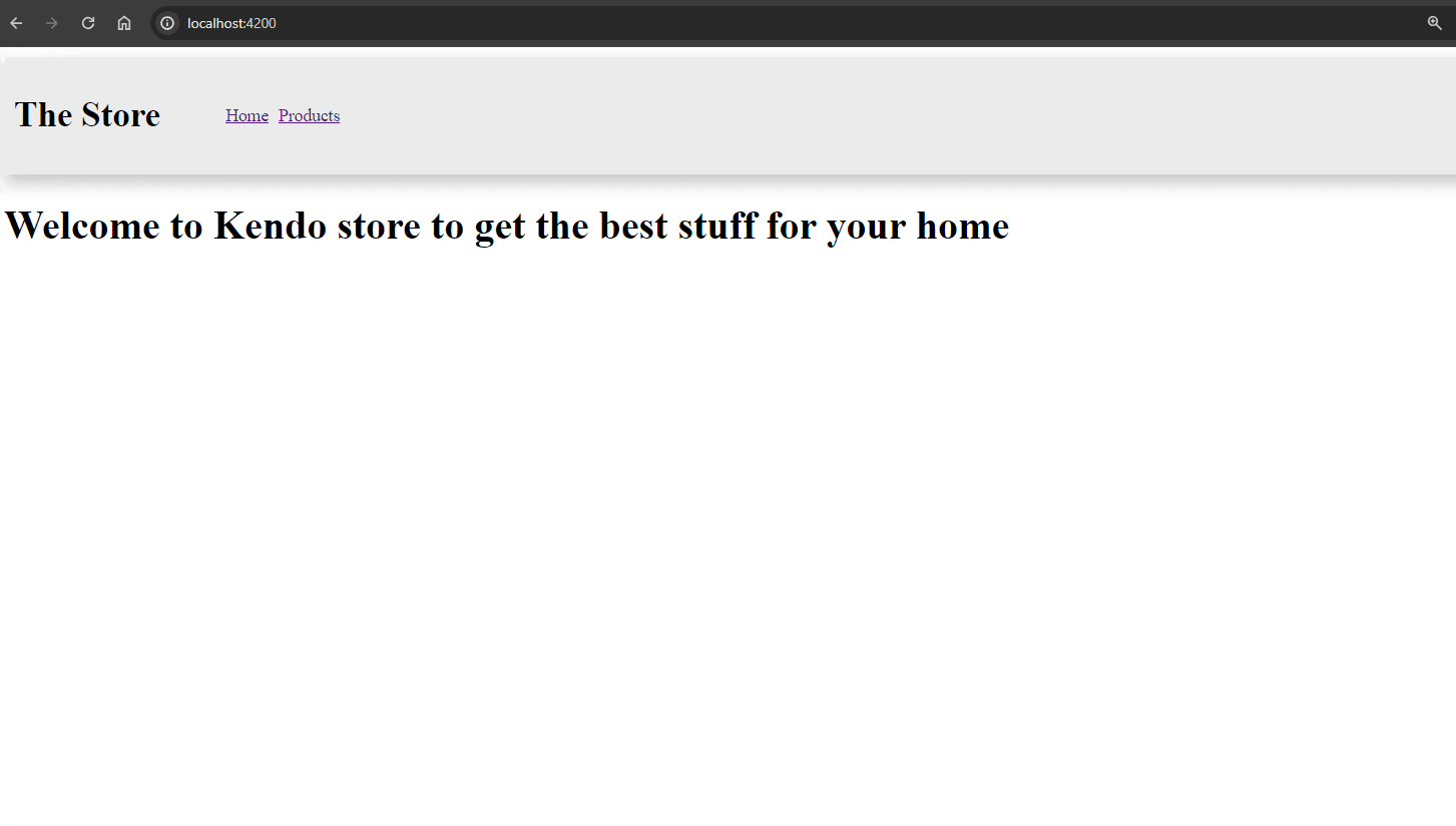
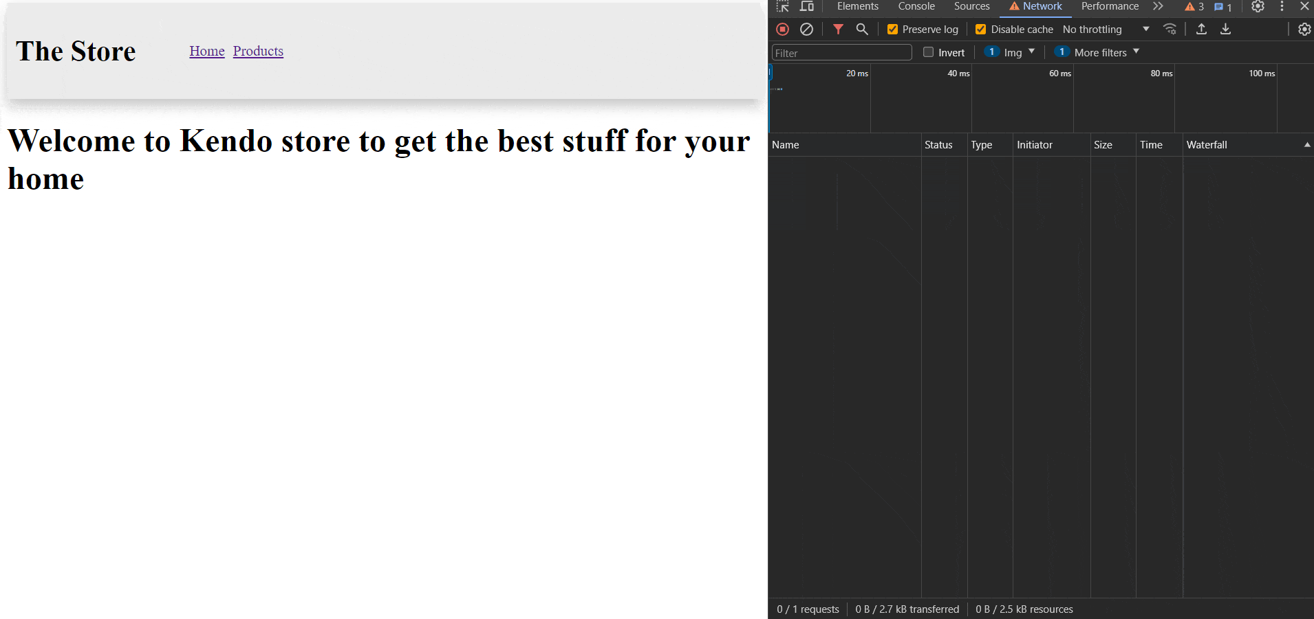
We can navigate to http://localhost:4200 to see the Store:
Great! Let’s focus on improving performance and implementing lazy loading.
The Bundle and Lazy Loading
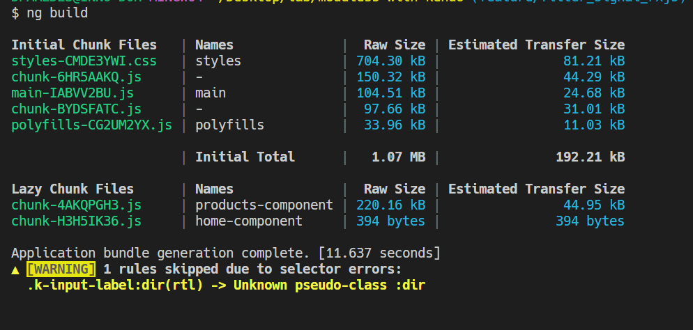
If you recall, when you run ng serve, it provides output with information about the initial chunk of files. However, this information isn’t optimized because it’s in development mode. Let’s run ng build to generate the production build version of the application.
$ ng build

Initial Chunk Files   | Names         |  Raw Size | Estimated Transfer Size
styles-CMDE3YWI.css   | styles        | 704.30 kB |                81.21 kB
main-VV7UTEN6.js      | main          | 568.48 kB |               137.16 kB
polyfills-CG2UM2YX.js | polyfills     |  33.96 kB |                11.03 kB

                      | Initial Total |   1.28 MB |               229.39 kB

Application bundle generation complete. [4.965 seconds]
▲ [WARNING] 1 rules skipped due to selector errors:
  .k-input-label:dir(rtl) -> Unknown pseudo-class :dir
No worries about the
.k-inputlabel warning. It occurs because the:dirpseudo-selector is not supported in the Chrome browser. You can verify this at the following link: caniuse.com/css-dir-pseudo. For further information, you can read more in this Kendo UI forum.
After reviewing all the information, let’s focus on the main file, which has a size of 568 KB. This is quite substantial. Is it really necessary for the user to download such a large amount of code when they enter the store?
The main.js bundle file contains app.component, home.component and products.component. However, if we only open the products.component when using the kendo-card, why should we send all those components to the user whether they navigate to the product section or not? It’s not optimized.
Let’s improve this using a nice Angular feature called “dynamic import”!
Dynamic Import
The store application loads everything into the main.js file, so we currently don’t have code splitting and lazy loading. However, we can make a small change in the app.route.ts file.
In the app.route.ts file, we import the Home and Product components to make a reference to these files.
import { Routes } from '@angular/router';
import {HomeComponent} from "./pages/home/home.component";
import {ProductsComponent} from "./pages/products/products.component";

export const routes: Routes = [
  {
    path: '',
    component:  HomeComponent,
  },
  {
    path: 'products',
    component: ProductsComponent,
  }
];
Instead of importing at the top and using the component property, we can change it to a loadComponent function. This function uses the import statement to resolve the component from the path and removes the reference in the route files.
The final code looks like:
import { Routes } from '@angular/router';
export const routes: Routes = [
  {
    path: '',
    loadComponent: () =>
      import('./pages/home/home.component').then((h) => h.HomeComponent),
  },
  {
    path: 'products',
    loadComponent: () =>
      import('./pages/products/products.component').then(
        (p) => p.ProductsComponent
      ),
  },
];
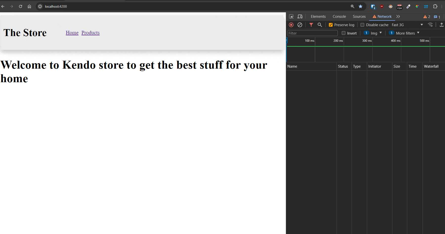
Save the changes and then run the ng serve -o command. You’ll notice a slightly different output:
Take a look at the main file; it has decreased from 568.48 KB to 104.51 KB! That’s an 81% decrease in size, which is quite impressive. Additionally, we now have two different bundles that are lazily loaded: the product and home components. This means that changes in the product won’t impact the home component. 🎉
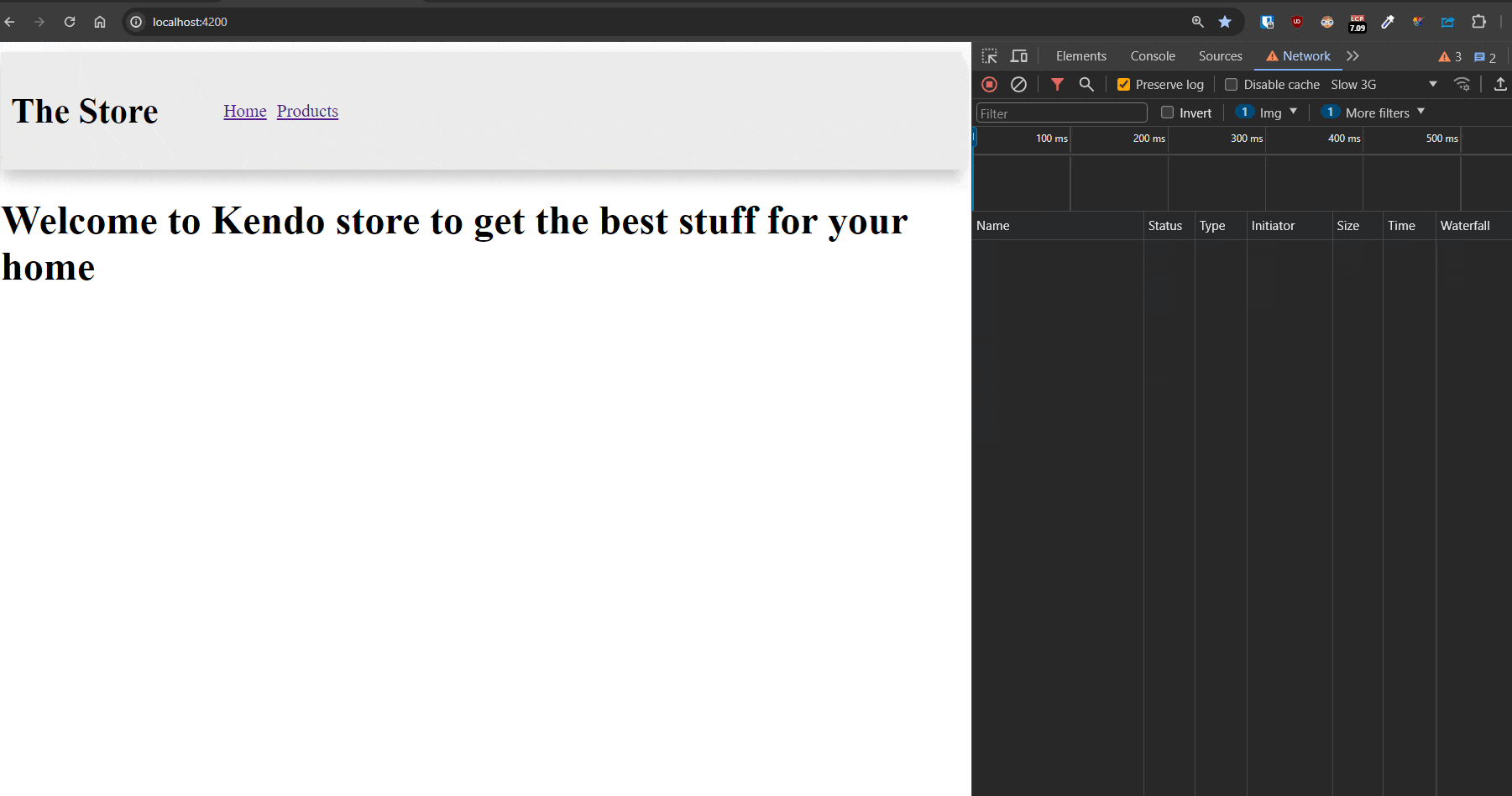
But we need to continue improving our store. Let’s navigate to the products area with a 3G connection and see what happens! 🤔
Why does it initially show no products and then, after a few seconds, show the products? This UX is not good, but it’s something we can easily improve. The Kendo UI components can help us fix all these issues quickly and easily! Let’s get started!
Loading Indicators
We want to enhance our UI, and Kendo UI provides a set of components ready to do just that! We can easily combine them with our existing code. In our case, we’ll use Kendo UI for Angular Indicators, which offers components like loaders and more.
First, let’s install the kendo-angular-indicators package using the schematics.
 ng add @progress/kendo-angular-indicators
i Using package manager: npm
√ Found compatible package version: @progress/kendo-angular-indicators@14.3.0.
√ Package information loaded.
Open the products.component.ts file, and in the imports section, add the IndicatorsModule to gain access to all components provided by Kendo UI Angular Indicators. Here’s how the code looks:
import { IndicatorsModule } from '@progress/kendo-angular-indicators';
@Component({
  selector: 'app-products',
  standalone: true,
  imports: [CardModule, IndicatorsModule, CurrencyPipe],
  templateUrl: './products.component.html',
  styleUrl: './products.component.scss',
})
....
In the template products.component.html, utilize the @if control flow with the $products variable. If $products doesn’t have a value, then display a Kendo UI loader component. Else, if there are $products, then show them (in the @else wrapper.
Learn more about Angular Control Flow.
The code looks like:
@if(!$products()) {
<div class="text-center">
  <kendo-loader type="pulsing" size="medium">
  </kendo-loader>
</div>
}
@else {
<section id="products">
  @for (product of $products(); track product.id) {
  <kendo-card width="200px">
    <img [src]="product.image" kendoCardMedia alt="cover_img" />
    <kendo-card-body>
      <h4>{{ product.title }}</h4>
    </kendo-card-body>
    <kendo-card-footer>
      <span>Price {{ product.price | currency }}</span>
      <span (click)="addFavorite(product)">❤</span>
    </kendo-card-footer>
  </kendo-card>
  }
</section>
}
Save changes, if the $products variable is not yet available, the loader component will be displayed. Once $products has a value, the products section will be shown. 🤌
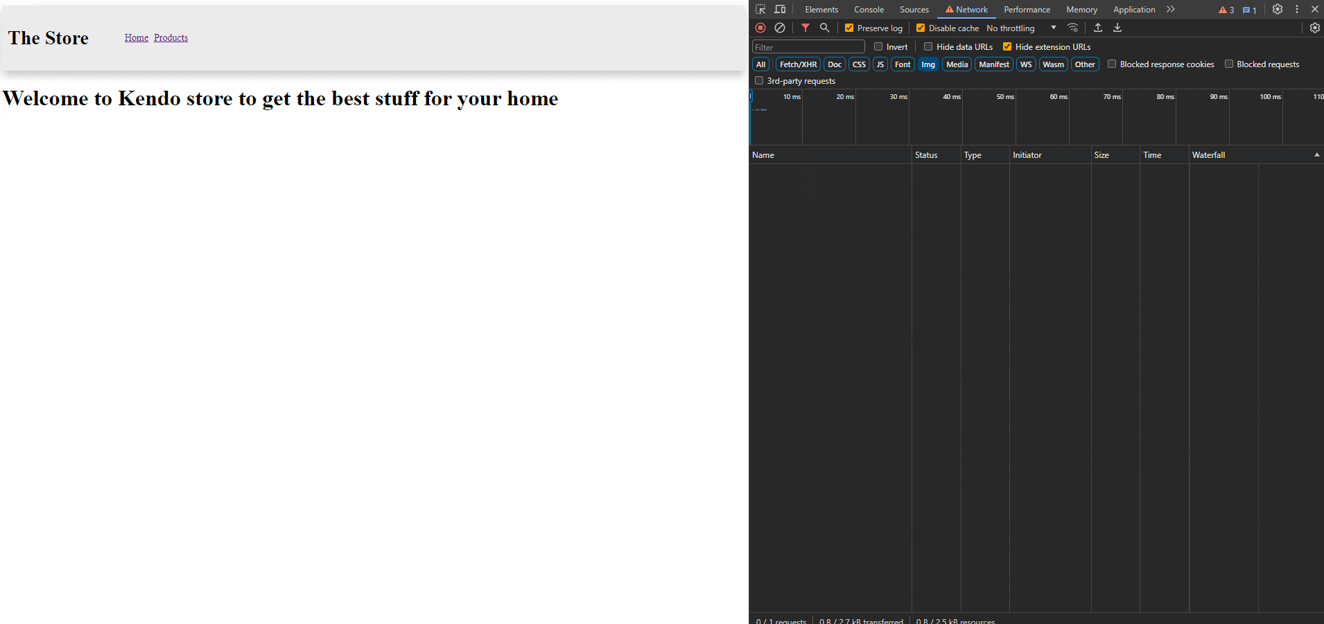
Do you think this is working? Let’s delve a bit deeper. Reopen the developer tools and navigate to the Network tab. Filter the results to display images. Then, navigate to the products page and observe how many images we are sending to the user, even if the user doesn’t view these products. Why might this be happening? 🤔
It impacts the user’s performance because we are sending images to the user even if they might not want to see them. How can we solve this issue? Well, Angular 17 comes with a very nice feature called Deferrable Views! Let’s play with it!
Deferrable Views
The Deferrable Views help to defer the load of components and dependencies, like child components, directives, pipes and CSS. We can add them to our app, declaratively, by wrapping the component with a @defer block.
Deferrable views help delay the loading of components and related parts, like child components, directives, pipes and CSS. We can add this feature to our app by wrapping the component with a @defer block.
Defer views work with triggers, prefeching, and sub-blocks like placeholder, loading and error. They reduce the initial bundle size of your application or delay loading heavy components that might not be needed until later. 🎆
Example:
@defer {
  <my-dashboard-heavy/>
}
The main content within the @defer block is loaded lazily and isn’t shown initially. It appears only when a specified trigger or when condition is met, and the necessary dependencies have been fetched. By default, a @defer block is triggered when the browser state becomes idle.
@placeholder
The @placeholder block is optional and displays content before the defer block is triggered. This placeholder content is replaced with the main content once loading is complete. You can use any content in the placeholder section, including plain HTML, components, directives and pipes. However, note that the dependencies of the placeholder block are loaded eagerly.
The @placeholder block accepts an optional parameter to specify the minimum time that the placeholder should be shown. This minimum parameter is specified in milliseconds (ms) or seconds (s). It prevents rapid flickering of placeholder content if the deferred dependencies are fetched quickly. The minimum timer for the @placeholder block starts after the initial rendering of the @placeholder block is complete.
@defer {
  <large-component />
} @placeholder (minimum 500ms) {
  <p>Placeholder content</p>
}
Triggers
When a @defer block is triggered, it replaces placeholder content with lazily loaded content. There are two options for configuring when this swap is triggered: on and when.
on specifies a trigger condition using a trigger from the list of available triggers, but in our case we will focus in on viewport.
viewport would trigger the deferred block when the specified content enters the viewport using the IntersectionObserver API. This could be the placeholder content or an element reference.
A nice point is multiple event triggers can be defined at once. For example: on viewport; on timer(5s) means that the defer block will be triggered if the user interacts with the placeholder, or after 5 seconds.
Example:
@defer (on viewport; on timer(5s)) {
  <nice-heavy-component />
} @placeholder {
 <div>Loading....</div>
}
Also use both when and on together in one statement, and the swap will be triggered if either condition is met.
@defer (on viewport; when cond) {
  <calendar-cmp />
} @placeholder {
  <img src="placeholder.png" />
}
OK, with this overview we can combine the defer and placeholder to improve the performance in our app.
Using Defer and Placeholders
In our case, we only want to load the card when it becomes visible in the viewport. To achieve this, open the products.component.html and wrap the card with a @defer block that triggers on viewport.
@defer (on viewport) {
  <kendo-card width="200px">
    <img [src]="product.image" kendoCardMedia alt="cover_img" />
    <kendo-card-body>
      <h4>{{ product.title }}</h4>
    </kendo-card-body>
    <kendo-card-footer class="k-hstack">
      <span>Price {{ product.price | currency }}</span>
      <span (click)="addFavorite(product)">❤</span>
    </kendo-card-footer>
  </kendo-card>
  }
In the placeholder with a minimum of 2 seconds, we’ll add a div to simulate the appearance of the <kendo-card> box. Here’s the HTML:
@placeholder(minimum 2s) {
  <div class="loading-area">
  </div>
}
In the product.component.scss, add the loading-area class:
.loading-area {
  width: 350px;
  height: 350px;
  opacity: 0.5;
  border-radius: 5px;
  background-color: lightblue;
}
Save the changes and observe how it works. These are significant changes! Now, we have an area for upcoming cards, and we only load the visible images. As we continue scrolling, new images are loaded dynamically. This approach significantly speeds up the loading time and reduces the amount of traffic in our app! These are fantastic improvements!
One More Thing!
We’ve created a nice-looking blue div, but what if I told you that you can easily create a loader card without needing to learn about creating fancy figures in CSS or animations? 😏
The Kendo UI for Angular Indicators module provides a Skeleton component that allows you to create a fancy loader card animation. I don’t want to overwhelm you with all the things we can do by combining Angular and Kendo UI, but let’s see how quickly we can create a nice animated skeleton.
First, let’s give our products.components.ts file access to the Kendo UI Indicator’s Module:
@Component({
selector: 'app-products',
standalone: true,
imports: [CardModule, CurrencyPipe, IndicatorsModule],
Now, open the products.component.html file again and navigate to the @placeholder(minimum 2s) area. Remove the div with loading-area class with a kendo-card and footer.
<kendo-card width="350px" style="margin: 1rem; height:350px;">
  <kendo-card-footer>
  </kendo-card-footer>
</kendo-card>
Inside the <kendo-card> component, we’re going to use skeleton components with shapes for each case. For example, we’ll use a rectangle shape for the image and text for the product name and price.
<kendo-skeleton
  shape="rectangle"
  animation="wave"
  width="100%"
  height="143.86px"
></kendo-skeleton>
The final card code looks like this:
<kendo-card width="350px" style="margin: 1rem; height:350px;">
  <kendo-skeleton
    shape="rectangle"
    animation="wave"
    width="100%"
    height="143.86px"
  ></kendo-skeleton>

  <kendo-card-footer>
    <kendo-skeleton
      shape="text"
      animation="wave"
      width="100%"
    ></kendo-skeleton>
    <kendo-skeleton
      shape="text"
      animation="pulse"
      width="80%"
    ></kendo-skeleton>
  </kendo-card-footer>
</kendo-card>
Save the changes and observe the nice animation!
Conclusion
This was such a fun article—we were able to get into improving Angular performance by leveraging lazy loading and the @defer feature in conjunction with some powerful Kendo UI components.
First, we learned about dynamic imports and lazy loading, which can significantly reduce the initial bundle size of our application. This not only improves loading times but also enhances the user experience by delivering only necessary code when needed, rather than overwhelming the user with unnecessary data.
The UI was improved by integrating Kendo UI components such as loaders, and skeletons, that further enhanced the user experience by providing visually appealing placeholders while content is loading, providing great feedback to the user and also keeping engagement during loading periods. 👌 Oftentimes, user feedback during loading is more important than the actual load time itself. With the power of Kendo UI Indicators, we can easily—and quickly—add this to our application!
Feel free to play with the source code and read some resources:
- Source code: https://github.com/danywalls/moduless-with-kendo
◦ Initial code: branch: “feature/filter_signal_rxjs”
◦ Final version: branch “feature/performance-defer-loading” - Kendo UI for Angular Indicators
- Using Defer Views in Angular
- Angular Control Flow
And don't forget: You can try Kendo UI for Angular free for 30 days!
Happy coding!
Dany Paredes
Dany Paredes is a Google Developer Expert on Angular and Progress Champion. He loves sharing content and writing articles about Angular, TypeScript and testing on his blog and on Twitter (@danywalls).
Related Posts
Comments
All articles
Topics
Web MobileMobile
Desktop
Design
Productivity
People
