
How to Implement the Scheduler Component in Your Next React Application

See how the KendoReact Scheduler component offers an intuitive and flexible solution for creating well-organized schedules in our React applications.
Handling events and managing time effectively are essential elements for any app dealing with appointments, meetings or deadlines. However, building this functionality from scratch can be a daunting task, requiring work needed to surface various components like calendar views, user interaction interfaces and synchronization with external data sources.
This is where Progress KendoReact’s Scheduler component comes in. This React Scheduler component offers an intuitive and flexible solution for creating well-organized schedules in our React applications. In this article, we’ll spend some time exploring the key features of the KendoReact Scheduler component and how they can help us create customizable scheduling interfaces easily.
The KendoReact Scheduler Component
The KendoReact Scheduler component is distributed through the kendo-react-scheduler NPM package and can be imported directly from this package. While installing the Scheduler component package, it’s necessary to install all supporting packages/dependencies that will potentially be used within the scheduler UI elements so that the Scheduler loads and works correctly.
npm install --save @progress/kendo-react-scheduler @progress/kendo-react-intl @progres/kendo-react-popup @progress/kendo-react-dialogs @progress/kendo-react-dateinputs @progress/kendo-react-dropdowns @progress/kendo-react-inputs @progress/kendo-react-buttons @progress/kendo-date-math @progress/kendo-react-form @progress/kendo-licensing @progress/kendo-svg-icons
Once we’ve installed the necessary packages, we can start integrating the Scheduler components into our project. Before we do this, we’ll first create an events-utc.js file that will contain the data for the events we want to be displayed in our scheduler.
const baseData = [
  {
    TaskID: 4,
    OwnerID: 2,
    Title: "Bowling tournament",
    Start: "2023-06-24T16:00:00.000Z",
    End: "2023-06-24T19:00:00.000Z",
    isAllDay: false,
  },
  {
    TaskID: 5,
    OwnerID: 2,
    Title: "Take the dog to the vet",
    Start: "2023-06-24T12:00:00.000Z",
    End: "2023-06-24T13:00:00.000Z",
    isAllDay: false,
  },
  {
    TaskID: 6,
    OwnerID: 2,
    Title: "Call Charlie about the project",
    Start: "2023-06-21T11:30:00.000Z",
    End: "2023-06-21T13:00:00.000Z",
    isAllDay: false,
  },
  {
    TaskID: 7,
    OwnerID: 3,
    Title: "Meeting with Alex",
    Start: "2023-06-22T14:00:00.000Z",
    End: "2023-06-22T16:00:00.000Z",
    isAllDay: false,
  },
  {
    TaskID: 9,
    OwnerID: 2,
    Title: "Alex's Birthday",
    Start: "2023-06-18T13:00:00.000Z",
    End: "2023-06-18T14:00:00.000Z",
    isAllDay: true,
  },
];
In the above code, we’ve created an array of objects, each representing an event or task. The fields declared in each object contain some information about the event or task such as its title, its start and end times, and an isAllDay property to dictate if the event is to be a full-day event.
In our events-utc.js file, we’ll also export a displayDate that will be used as the initial default date in our calendar in addition to a sampleData array that will be the sample array data we’ll feed into our scheduler components.
In the calendar examples we create in this article, we’ll have all our events and tasks arbitrarily scheduled for June 2023 so we’ll have our displayDate value be June 24, 2023, at midnight UTC.
const baseData = [
  {
    TaskID: 4,
    OwnerID: 2,
    Title: "Bowling tournament",
    Start: "2023-06-24T16:00:00.000Z",
    End: "2023-06-24T19:00:00.000Z",
    isAllDay: false,
  },
  {
    TaskID: 5,
    OwnerID: 2,
    Title: "Take the dog to the vet",
    Start: "2023-06-24T12:00:00.000Z",
    End: "2023-06-24T13:00:00.000Z",
    isAllDay: false,
  },
  {
    TaskID: 6,
    OwnerID: 2,
    Title: "Call Charlie about the project",
    Start: "2023-06-21T11:30:00.000Z",
    End: "2023-06-21T13:00:00.000Z",
    isAllDay: false,
  },
  {
    TaskID: 7,
    OwnerID: 3,
    Title: "Meeting with Alex",
    Start: "2023-06-22T14:00:00.000Z",
    End: "2023-06-22T16:00:00.000Z",
    isAllDay: false,
  },
  {
    TaskID: 9,
    OwnerID: 2,
    Title: "Alex's Birthday",
    Start: "2023-06-18T13:00:00.000Z",
    End: "2023-06-18T14:00:00.000Z",
    isAllDay: true,
  },
];

const currentYear = new Date().getFullYear();
const parseAdjust = (eventDate) => {
  const date = new Date(eventDate);
  date.setFullYear(currentYear);
  return date;
};

// displayDate and sampleData to be used in Scheduler component
export const displayDate = new Date(Date.UTC(currentYear, 5, 24));
export const sampleData = baseData.map((dataItem) => ({
  id: dataItem.TaskID,
  start: parseAdjust(dataItem.Start),
  end: parseAdjust(dataItem.End),
  isAllDay: dataItem.isAllDay,
  title: dataItem.Title,
  ownerID: dataItem.OwnerID,
}));
In our parent App component instance, we can now import the sampleData and displayDate values and use them as props as we render the main Scheduler component.
import * as React from "react";
import { Scheduler } from "@progress/kendo-react-scheduler";
import { sampleData, displayDate } from "./events-utc";

const App = () => {
  return (
    <Scheduler data={sampleData} defaultDate={displayDate}>
      {/* ... */}
    </Scheduler>
  );
};

export default App;
Just with the above changes alone, we’ve rendered a simple daily scheduler that lists the events and tasks at their respective days and times!
Scheduler Views
The KendoReact Scheduler component offers several views to cater to different scheduling needs. Each view can be easily integrated and customized according to our application’s requirements.
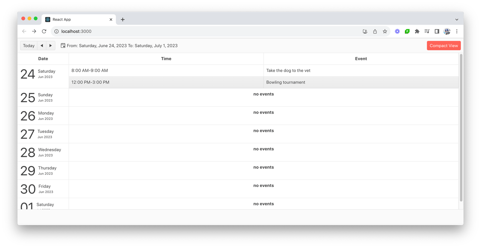
For example, we can use the Agenda view to display a weekly summary in a table format.
import * as React from "react";
import { Scheduler, AgendaView } from "@progress/kendo-react-scheduler";
import { sampleData, displayDate } from "./events-utc";

const App = () => {
  return (
    <Scheduler data={sampleData} defaultDate={displayDate}>
      <AgendaView
        title="Compact View"
        step={2}
        numberOfDays={8}
        selectedDateFormat={"From: {0:D} To: {1:D}"}
        selectedShortDateFormat={"From: {0:d} To: {1:d}"}
      />
    </Scheduler>
  );
};
export default App;
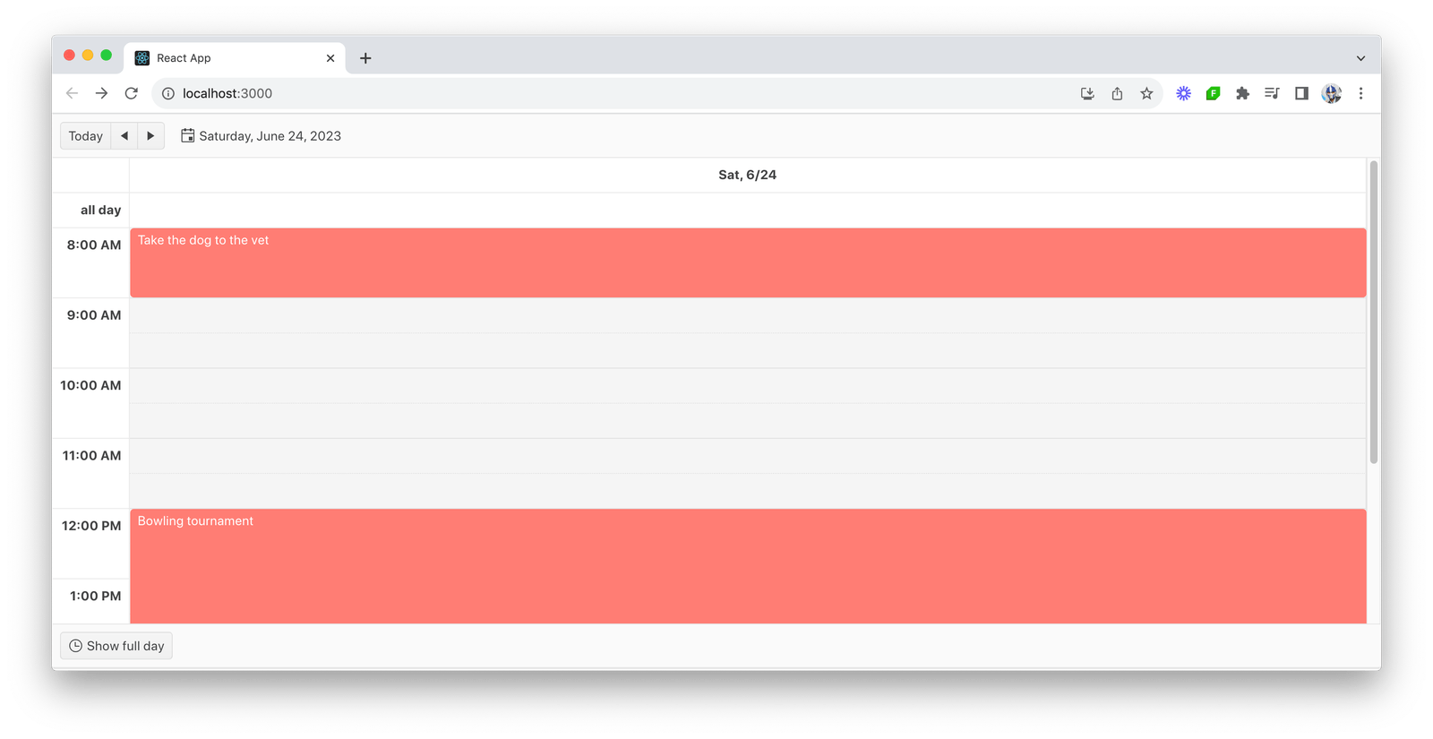
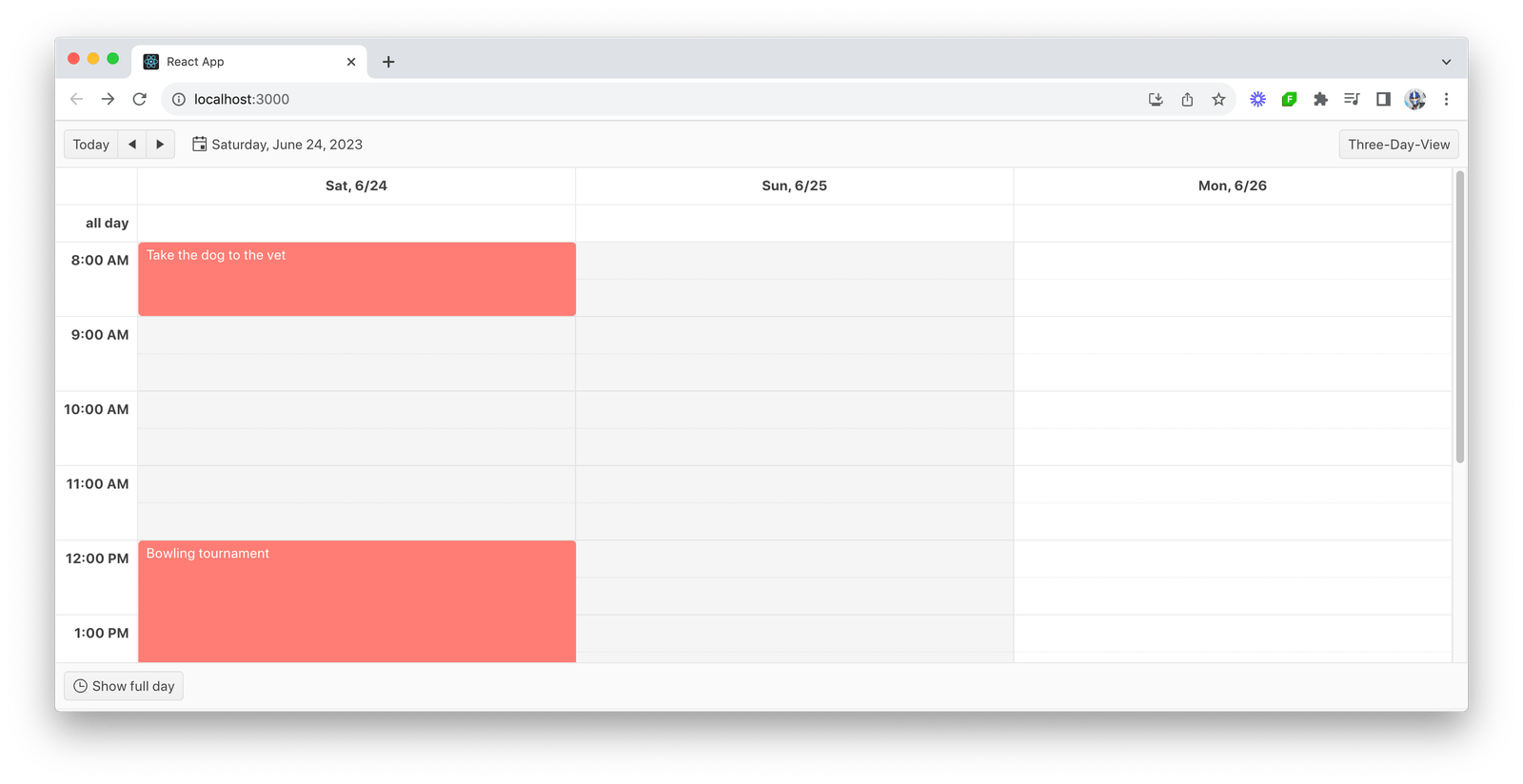
Alternatively, we can use the Day view to display events in a familiar calendar day-to-day layout.
import * as React from "react";
import { Scheduler, DayView } from "@progress/kendo-react-scheduler";
import { sampleData, displayDate } from "./events-utc";

const App = () => {
  return (
    <Scheduler data={sampleData} defaultDate={displayDate}>
      <DayView
        title="Three-Day-View"
        numberOfDays={3}
        slotDuration={60}
        slotDivisions={2}
        startTime={"07:00"}
        endTime={"19:00"}
        workDayStart={"08:00"}
        workDayEnd={"18:00"}
      />
    </Scheduler>
  );
};

export default App;
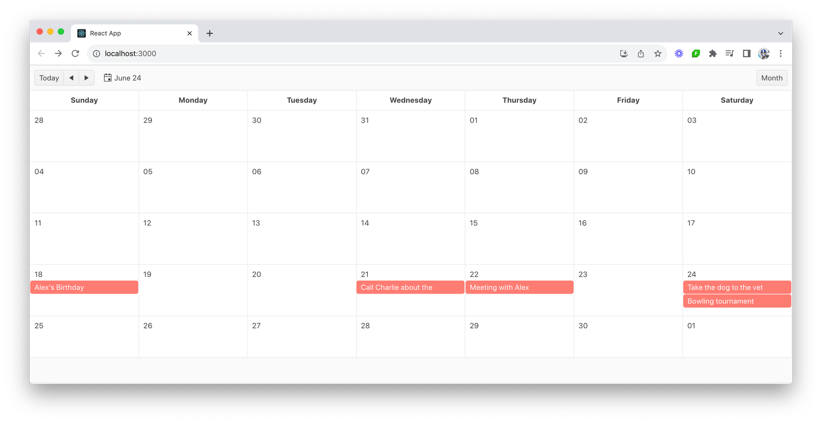
We can use the Month view to display a high-level schedule overview organized by weeks.
import * as React from "react";
import { Scheduler, MonthView } from "@progress/kendo-react-scheduler";
import { sampleData, displayDate } from "./events-utc";

const App = () => {
  return (
    <Scheduler data={sampleData} defaultDate={displayDate}>
      <MonthView
        title="Month"
        selectedDateFormat="{0:M}"
        selectedShortDateFormat="{0:M}"
      />
    </Scheduler>
  );
};

export default App;
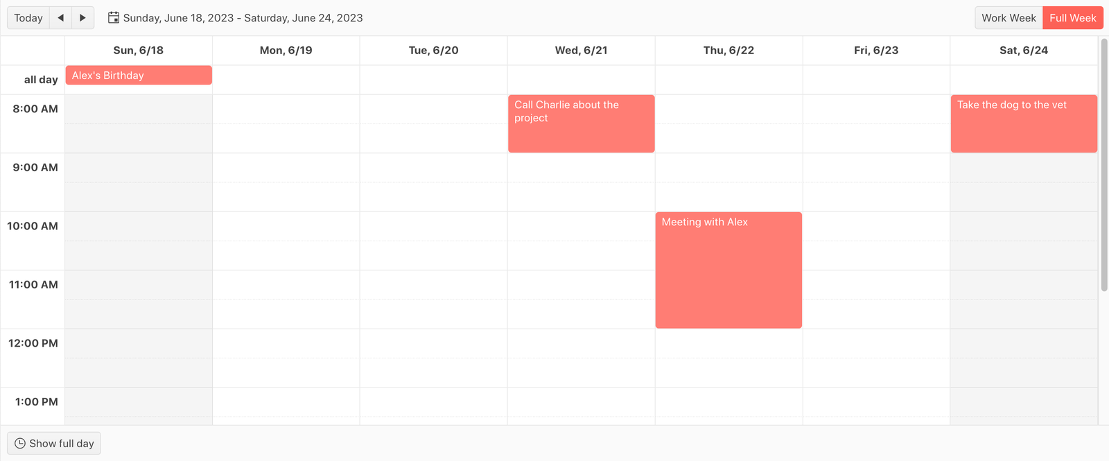
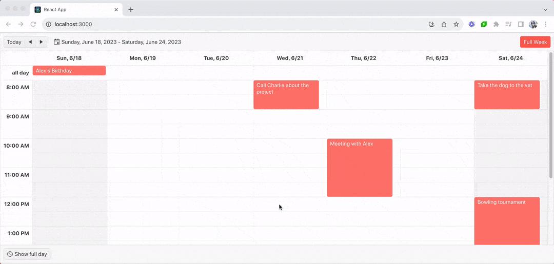
The Week and WorkWeek views help display a familiar calendar layout with a pre-defined number of days and navigation step.
import * as React from "react";
import {
  Scheduler,
  WeekView,
  WorkWeekView,
} from "@progress/kendo-react-scheduler";
import { Day } from "@progress/kendo-date-math";
import { sampleData, displayDate } from "./events-utc";

const App = () => {
  return (
    <Scheduler data={sampleData} defaultDate={displayDate}>
      <WorkWeekView
        title="Work Week"
        workWeekStart={Day.Monday}
        workWeekEnd={Day.Friday}
      />
      <WeekView
        title="Full Week"
        workWeekStart={Day.Monday}
        workWeekEnd={Day.Friday}
      />
    </Scheduler>
  );
};

export default App;
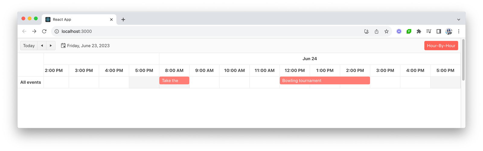
Lastly, the Timeline view displays events on a continuous time-scale.
import * as React from "react";
import { Scheduler, TimelineView } from "@progress/kendo-react-scheduler";
import { Day } from "@progress/kendo-date-math";
import { sampleData, displayDate } from "./events-utc";

const App = () => {
  return (
    <Scheduler data={sampleData} defaultDate={displayDate}>
      <TimelineView
        title="Hour-By-Hour"
        numberOfDays={2}
        columnWidth={100}
        slotDuration={60}
        slotDivisions={1}
        startTime={"08:00"}
        endTime={"18:00"}
        workDayStart={"09:00"}
        workDayEnd={"17:00"}
        workWeekStart={Day.Sunday}
        workWeekEnd={Day.Monday}
        showWorkHours={false}
      />
    </Scheduler>
  );
};

export default App;
Handling Data Changes
The KendoReact Scheduler’s flexibility in handling data changes is a critical feature, especially in dynamic scheduling applications where events can be frequently added, updated or deleted. The onDataChange() callback is central to managing these changes, ensuring that the Scheduler’s state remains in sync with the underlying data.
We’ll expand on the Week view example we created above to first ensure data used in the Scheduler is kept within component state.
import * as React from "react";
import { Scheduler, WeekView } from "@progress/kendo-react-scheduler";
import { Day } from "@progress/kendo-date-math";
import { sampleData, displayDate } from "./events-utc";

const App = () => {
  const [data, setData] = React.useState(sampleData);

  return (
    <Scheduler data={data} defaultDate={displayDate}>
      <WeekView
        title="Full Week"
        workWeekStart={Day.Monday}
        workWeekEnd={Day.Friday}
      />
    </Scheduler>
  );
};

export default App;
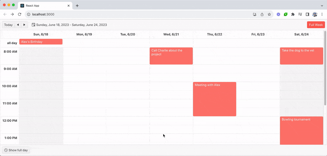
Dragging Events
The Scheduler component can receive an editable prop that dictates if the Scheduler component is editable and what types of editing it supports. For our first example, we can enable the drag functionality (i.e., functionality to drag events within the schedule) by setting the editable.drag property of the Scheduler to true.
<Scheduler
  data={data}
  defaultDate={displayDate}
  editable={{
    drag: true, // Enables dragging of events
  }}
>
  {/* ... */}
</Scheduler>
When an event is dragged to a new time slot, the onDataChange() callback of the component is triggered. The onDataChange() callback can handle various types of data alterations. This callback function encompasses three key collections of items:
- updated – represents all items that have been modified in our data set
- created – includes all new items that have been added to our scheduler
- deleted – contains all items that have been removed from our data set
For the dragging capability, the updated event will be passed in the updated array of the callback argument. We’ll use this to update the event state used in our scheduler.
const App = () => {
  const [data, setData] = React.useState(sampleData);

  const handleDataChange = React.useCallback(
    ({ updated }) => {
      setData((old) =>
        old.map(
          (item) => updated.find((current) => current.id === item.id) || item
        )
      );
    },
    [setData]
  );

  return (
    <Scheduler
      data={data}
      defaultDate={displayDate}
      onDataChange={handleDataChange}
      editable={{
        drag: true,
      }}
    >
      <WeekView
        title="Full Week"
        workWeekStart={Day.Monday}
        workWeekEnd={Day.Friday}
      />
    </Scheduler>
  );
};

export default App;
With this change, we’ll be able to modify the times and days an event resides in by simply dragging it across the scheduler!
Deleting Events
To delete events from the scheduler, we can enable the editable.remove property to true and use the deleted array of the onDataChange() callback to update the event state whenever an event is removed.
const App = () => {
  const [data, setData] = React.useState(sampleData);

  const handleDataChange = React.useCallback(
    ({ deleted }) => {
      setData((old) =>
        old.filter(
          (item) =>
            deleted.find((current) => current.id === item.id) === undefined
        )
      );
    },
    [setData]
  );

  return (
    <Scheduler
      data={data}
      defaultDate={displayDate}
      onDataChange={handleDataChange}
      editable={{
        remove: true,
      }}
    >
      <WeekView
        title="Full Week"
        workWeekStart={Day.Monday}
        workWeekEnd={Day.Friday}
      />
    </Scheduler>
  );
};
With this change applied, our scheduler provides the capability for us to remove events by clicking a remove icon in the event and confirming the deletion in a confirmation modal that appears.
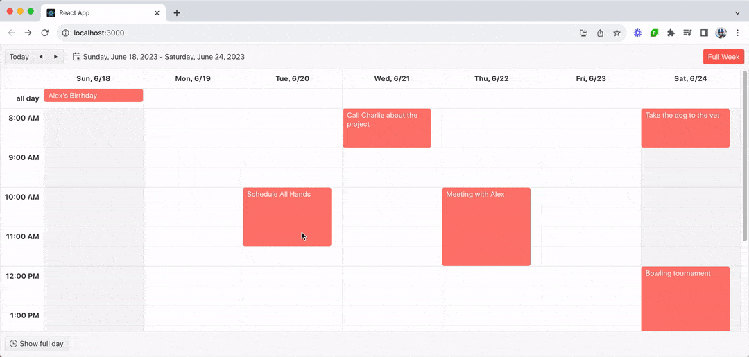
Adding and Editing Events
In addition to being able to drag and delete events, the KendoReact Scheduler also provides the functionality to add and edit events seamlessly. This is achieved by enabling the editable.add and editable.edit properties in the Scheduler component and leveraging the created and updated arrays in the onDataChange() callback.
const App = () => {
  const [data, setData] = React.useState(sampleData);

  const handleDataChange = React.useCallback(
    ({ created, updated }) => {
      setData((old) =>
        old
          .map(
            (item) => updated.find((current) => current.id === item.id) || item
          )
          .concat(
            created.map((item) =>
              Object.assign({}, item, {
                id: guid(),
              })
            )
          )
      );
    },
    [setData]
  );

  return (
    <Scheduler
      data={data}
      defaultDate={displayDate}
      onDataChange={handleDataChange}
      editable={{
        add: true,
        edit: true,
      }}
    >
      <WeekView
        title="Full Week"
        workWeekStart={Day.Monday}
        workWeekEnd={Day.Friday}
      />
    </Scheduler>
  );
};
With these additions, our scheduler now fully supports adding and editing events. To add an event, we can double-click a calendar and fill in the details in the add event modal that appears.
To edit an event, we can double-click an existing event in the calendar and modify the event information within the edit modal that appears.
Wrap-up
The KendoReact Scheduler component is a versatile tool that can be easily adapted to the dynamic needs of scheduling applications. Through its editable capabilities, developers can provide users with an intuitive and efficient interface for managing their schedules, whether it’s adding, updating, deleting or dragging events.
Everything we’ve covered in this article is only a subset of capabilities and features the KendoReact Scheduler component provides. For more details on advanced features like customization, time zones, globalization, keyboard navigation, etc., be sure to check out the official component documentation!
And don’t forget, KendoReact comes with a free 30-day trial if you’re ready to give it a spin.

Hassan Djirdeh
Hassan is a senior frontend engineer and has helped build large production applications at-scale at organizations like Doordash, Instacart and Shopify. Hassan is also a published author and course instructor where he’s helped thousands of students learn in-depth frontend engineering skills like React, Vue, TypeScript, and GraphQL.
Related Posts
Comments
All articles
Topics
Web Mobile DesktopDesktop
Design
Productivity
People

Latest Stories
in Your Inbox
Subscribe to be the first to get our expert-written articles and tutorials for developers!
All fields are required