How to Get More People to Notice Special Offers on Your Website

BOGO sales, free shipping and rewards programs can help keep consumers buying from you—if they know about them. Let’s look at ways at design them for maximize impact.
New data shows that online shoppers are changing their spending habits due to the increased cost of living. With so many people focused on finding the best deal, sales and other special offers can help ecommerce companies stay in the game.
But as we know, we don’t have long to capture the attention of our visitors. Within seconds, they’ll decide if they want to stay or go. They’re likely making just as hasty split-second judgments about your sales, too.
In this post, we’re going to look at different ways to display special offers on your site in order to maximize views and purchases.
4 Ways to Effectively Promote Ecommerce Sales
According to the Forter ecommerce study, more than 60% of shoppers have changed their online spending habits in recent years.
Doriel Abrahams, the principal technologist at Forter says:
“The cost-of-living increase means that consumers are fundamentally altering their online shopping habits. Brands that want to maintain customer loyalty and value in this macro environment must evolve, too. From the simple—but important—perks to the full checkout experience, consumers want more and better from their favorite brands.”
In a recent post, we looked at ways to improve the ecommerce checkout experience. Now, we’re going to look at how to make your brand’s perks stand out more. According to this survey, these are the kinds of perks that would entice people to shop from an ecommerce website on a regular basis:
- Free shipping (63%)
- Affordable goods (61%)
- Frequent sales (36%)
- Free and easy returns (34%)
- Loyalty programs (33%)
We’re not going to worry so much about the perks themselves since that’s for the company to worry about. What we are going to focus on is how to draw visitors’ attention to these special offers on your site:
1. Use Bright Colors
While looking through websites for this article, I realized that red is overwhelmingly the go-to color for sales. Here’s an example from the Urban Outfitters homepage:
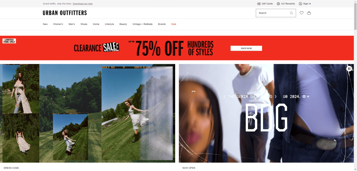
What’s nice about the way Urban Outfitters has designed this banner is that it’s not what you traditionally see on ecommerce sites. Usually, designers choose one of two options:
- Add a thin notification bar to the top of the screen
- Advertise the sale in the hero section
This one instead sits just below the navigation and it’s much thicker than the standard sticky notification bar. The bright red color, sale sticker appearance and bold typography also make this banner hard to miss.
I get why brands choose red. Color psychology tells us that red is an effective color in design. It signals urgency, cravings and importance.
But that doesn’t necessarily make red the most effective color for your sale, especially if it doesn’t fit your branding. Urban Outfitters has a youthful and edgy style, so it looks great on the website. For others, it might not.
The trick is to find colors that fit well with your branding, but that also pop out from the page. You want your shoppers’ eyes to go directly to the sales components on your site.
ZARA has a unique example of how to do this.
Typically, the ZARA logo is white. However, when the shopper scrolls down to the next section on the homepage, both the “Sale” heading text and the ZARA logo turn neon green. And when the shopper opens the hamburger menu navigation, all of the categories with on-sale items have a bright green “Sale” button at the top of the list.
So not only has the designer used color to draw attention to all the sale elements on the site, they’ve also used hierarchy to make them easy to find in the navigation (more on that next).
2. Prioritize Sale Navigation Links
We can demonstrate priority and importance in a website navigation using a few different methods.
One option is to place a “Sale” link at the front of the navigation links. Or at the very end. The first and last item in a series are the ones that people notice and remember the most, according to the Serial Position Effect.
The one thing you want to keep in mind with this tactic is what message it’s sending to shoppers. For example, MeUndies places the “Sale” link at the end of all its other navigation links.
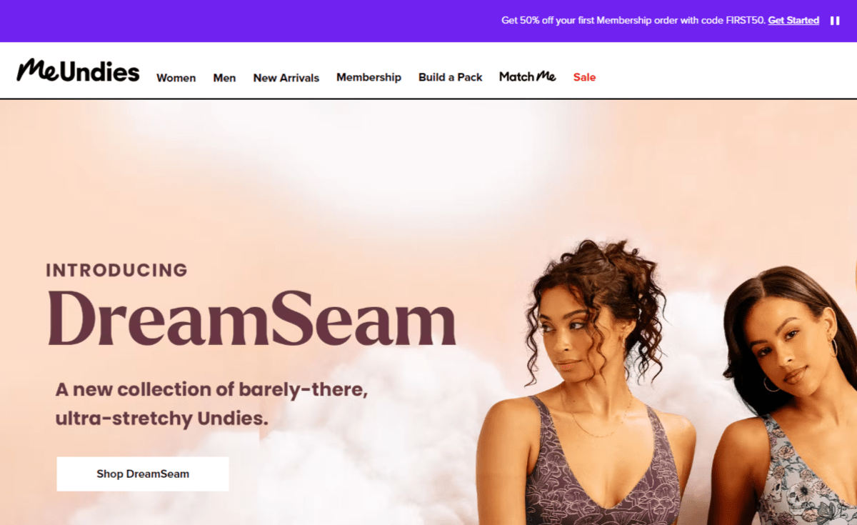
The link is in red, so it’s clear that the company wants to make it easy for shoppers to find it. However, it’s not in the first spot. That first spot in the navigation is prime territory. Unless you’re running a massive sale—like during Black Friday—you might not want to give your sales items top billing on your site.
You can always shift this “Sale” link around depending on the time of year. So, let’s say it’s summer and you don’t have any massive sales events going on. The link can sit at the end of your navigation. However, around October or November, you move it up to the front for holiday shoppers.
Another thing you can do is use color to make the link stand out. That’s what MeUndies does above and that’s also what Rooms to Go does.
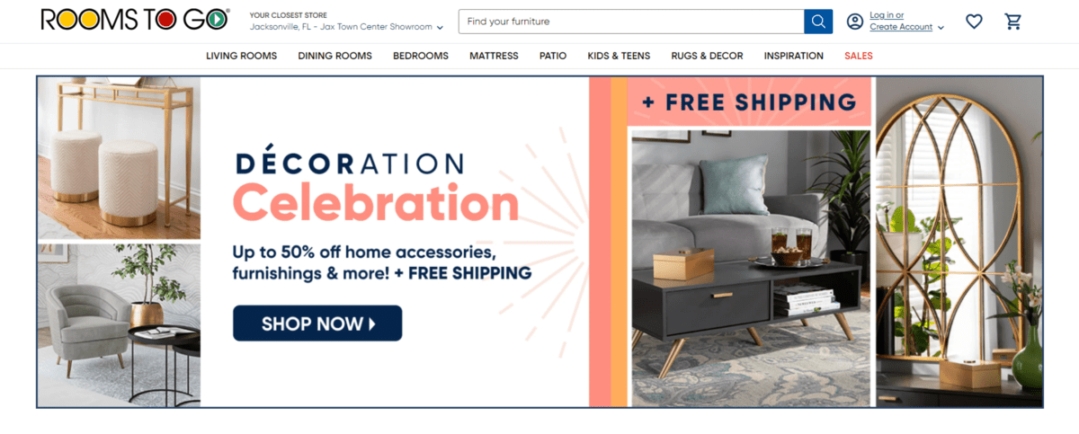
There are some companies that don’t apply any color to the link at all. With that design decision, they may be hoping that—even when placed at the front or end of the navigation—that shoppers don’t notice it straight off the bat. With the color applied, though, it’s a welcoming sign to customers to shop your sales.
One other thing you can do is to make your sales-related link or category bigger than others. We see an example of this on the Food Lion website.
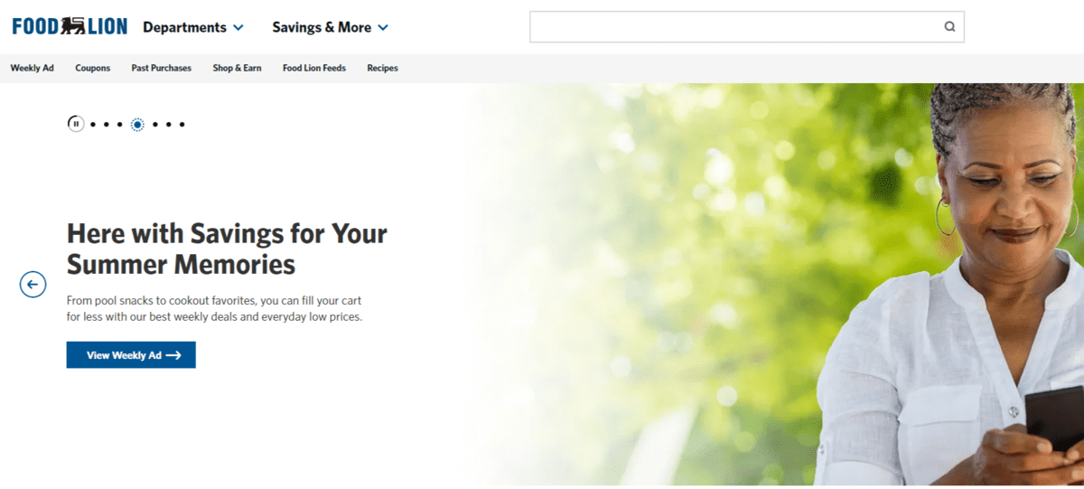
Because this is a website for a grocery store, it’s not so much about advertising sales as it is helping shoppers rack up savings in the form of coupons, discounted items, rewards points and more.
In the header of this site, we see two larger links/dropdowns for Departments and Savings & More. Because of their placement directly to the right of the logo and due to their size compared to the navigation, shoppers are sure to explore these areas of the site before all the rest.
3. Add Special Offers Right by the Navigation
It shouldn’t just be your homepage visitors that benefit from seeing what kinds of sales, credit card offers or free shipping you offer. Nor should shoppers have to return to the homepage to get your latest coupon code or to remind themselves about which kinds of items are on sale.
The best way to conserve space while keeping these special offers front and center is by placing them in a notification bar.
Here’s an example of what that looks like on the Athleta website:
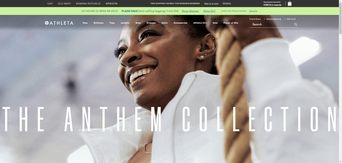
Athleta technically has two bars above its main header. The one in black contains links to sister sites as well as a free shipping offer for members. The second one is a more traditional notification bar with a timer counting down the company’s latest flash sale. This bar is likely to get the most attention because of its soft lime green color.
The conventional way to announce sales in a space-saving manner is to do what Athleta has done here. And it works. Designers have been using this space for long enough that shoppers know to look there for free shipping or sales codes. And adding a bright pop up color the way Athleta has done helps.
That said, I’m noticing a new trend whereby brands add a thicker bar just below the navigation. In some cases, it includes a summary of the brand’s offers.
Michaels, for instance, has a bright red bar with three offers announcing:
- 20% off regular purchases
- 9% in rewards for Michaels credit card users
- Free shipping over $49

This layout is good if you want to call attention to different methods to save money. In the study I mentioned earlier, shoppers are interested in a variety of money-saving methods, like free shipping, rewards programs and regular sales. We see these different methods called out here.
There are other ways brands are putting this section to use.
In the case of a brand like DSW, for instance, they’ve converted it into a carousel full of special offers.
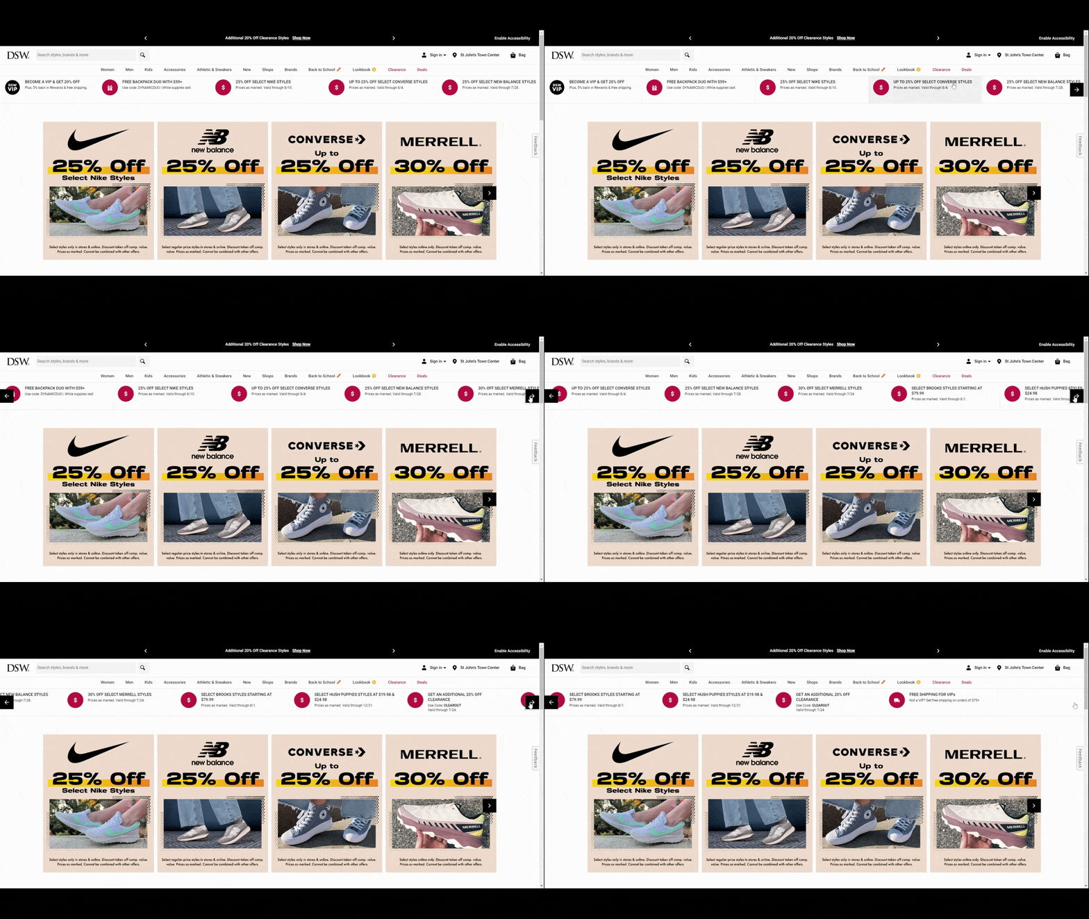
In addition to announcing free shipping and VIP discounts, shoppers find special deals on different shoe brands as well as free gifts. As they scroll through the offers, all they have to do is click on the link and they’ll be taken to the corresponding category page.
4. Do Something Unexpected
If you’ve been designing ecommerce sites or shopping on them for awhile, you get used to the ways in which they’re designed. That’s not a bad thing. Comfortable online experiences can speed up the shopping experience while also increasing customer confidence.
At the same time, we do want customers to feel something when they spot sales on a website, especially if they’re anxious about spending money. So your special offers aren’t something you want them to miss or easily discard. You want them to stop, notice what the offer says, and actively make a choice to engage or not.
So deviating from what users are expecting can help your deals stick out more. You can do this by adding movement, animating the component or using a design that looks unlike anything they’d find somewhere else.
Palmetto Moon, for instance, does have free shipping, 10% off for first-time customers and sales items scattered around the site. However, what you don’t see all that often is this hero image. Or, rather, the offer within it.
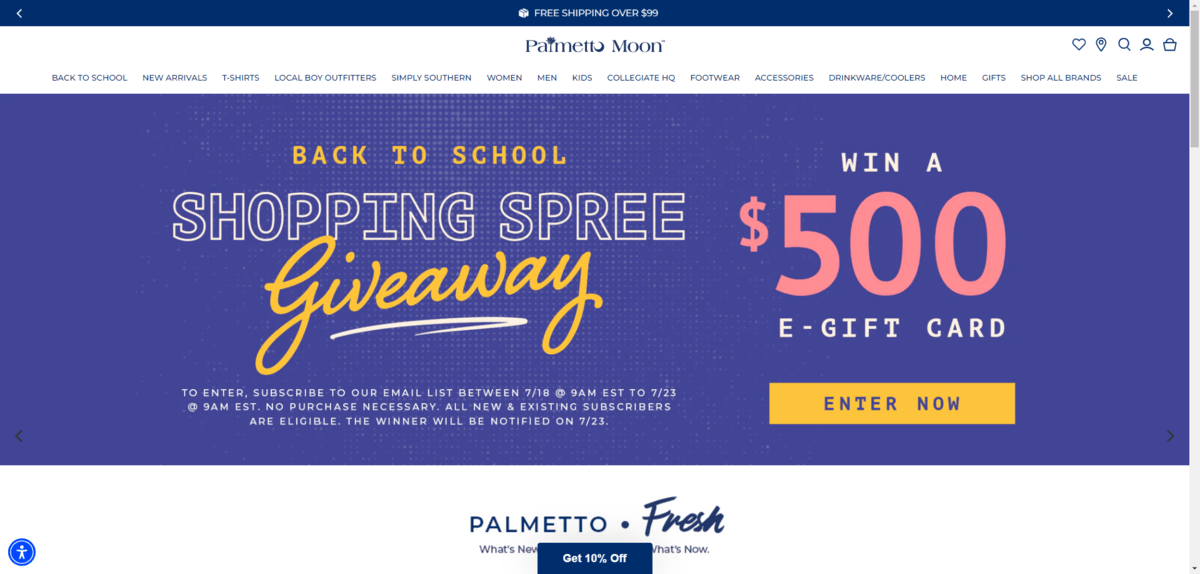
Most ecommerce companies use this above-the-fold space to encourage shopping by advertising current sales. That’s the company’s top priority after all. However, Palmetto Moon has used this space to invite customers to enter a $500 giveaway with no purchase necessary either. It might catch customers off guard who are expecting to see 20% off digital signage and the like.
Another way to surprise your shoppers is by ditching the traditional sales announcement designs—be they in the hero image or as notification bars—and come up with your own. You can see how Altar’d State has done this:
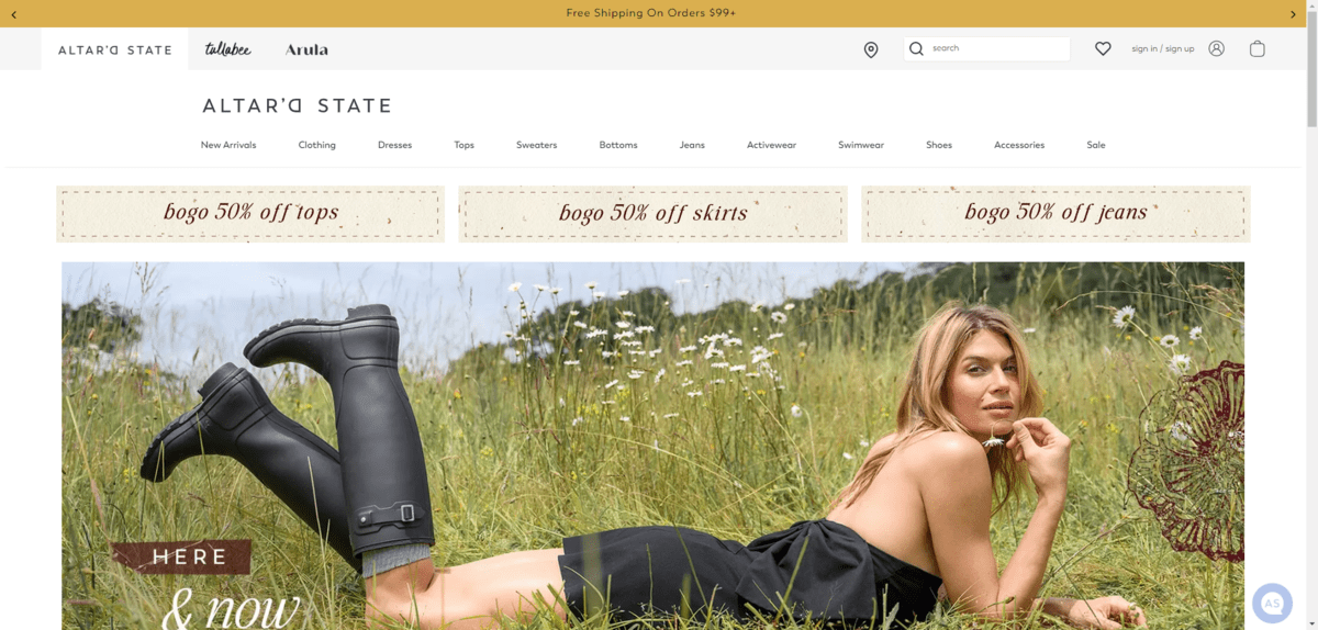
The placement of these BOGO offers is no different than the special offer notification bars we saw in the last point. However, the rustic label-like design of these special offers and the ample white space around them make them stand out. It’s going to be difficult to miss them.
There are other ways to surprise shoppers with the unexpected. For example, the Macy’s hero section deviates in two big ways from the norm.
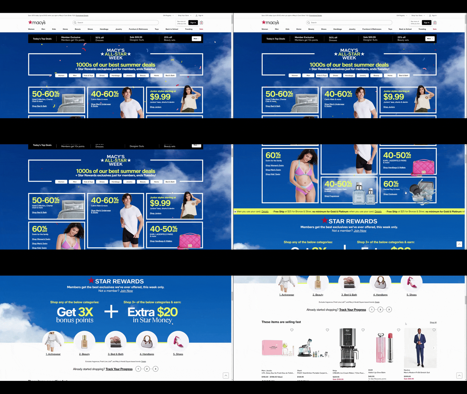
The first is the confetti animation. There’s a slight delay before it starts. It’s probably to give customers a chance to start reading the text in the hero image before being surprised by the animation.
The second is how long this hero section is. It doesn’t end at the fold or even just below it. It takes about two full scrolls to look through all of Macy’s deals as well as the information on loyalty rewards points.
Wrapping Up
When the cost of living goes up, it’s only natural for consumers to look for ways to cut back on spending. Since there are certain items they can’t go without—like groceries and clothing—they are savvy enough to capitalize on ecommerce sales.
Now, it’s up to your employer or client to supply them with these discounts, free shipping offers, rewards programs and so on. However, it’s your job to make sure they don’t get missed on the website. Besides announcing sales in the traditional spots, you can also do things like use bright colors, make “Sale” navigation links pop, try something different with the notification bar and surprise your shoppers.

Suzanne Scacca
A former project manager and web design agency manager, Suzanne Scacca now writes about the changing landscape of design, development and software.

