
Editing Data in Telerik UI for ASP.NET Core Grid: No Code Required
 by Peter Vogel

Summarize with AI:
Give your users the option to edit the data in their ASP.NET Core Grid. It’s easier than you may think.
Progress Telerik UI for APS.NET DataGrid gives you lots of options for supporting your user when updating data and, as you’ll see, makes it easy to configure the grid to deliver the UX that you want.
That’s not to say that you can’t integrate code with the grid, if you need to. But the grid will let you knock together a very functional prototype in a short period of time, letting you get started on both functional and UX testing sooner (and “you can’t start testing early enough” is the fourth of the four truths about testing). Just don’t be surprised if your testing demonstrates that you don’t ever need to add any code.
Updating Scenarios
Before you start configuring your grid, you should consider that there are, at least, four different scenarios that you can want the grid to support:
- Updating values anywhere in the grid: Consider an enterprise application where the user is reviewing batches of customer information, imported from some data source, and correcting any errors in the batch. The user wants to be able to scan the data and fix any problems. In this scenario, the user isn’t working on a row-by-row basis.
- Updating individual rows: Here, think about a typical line-of-business application—the user is working with only one or two rows in the grid but typically needs to update multiple columns in a row. A good example would be updating the information for a single customer in a list of customers because new information about the customer has come in.
- Adding a new row: Again, a typical scenario in a line-of-business application—the user adds a new customer, updating all (or almost all) of the properties associated with the customer.
- Deleting an existing row: This scenario is common both the batch and line-of-business scenarios. In the enterprise batch scenario, the solution to a problem customer may be to delete that customer. In the line-of-business scenario, a user may choose to delete one or two customers from a list of customers.
In the update and add scenarios, you also need to consider how the data will be presented to the user:
- For simple updates of key data or where an object doesn’t have many properties: The user may just update the information in the row in the grid.
- For adding a new customer: Typically, in this scenario, many properties need to be entered, so the user may prefer to have something like a form to enter the data rather working in a row in the middle of a grid.
- There are too many columns for easy editing: In this scenario, the grid just presents enough data for users to quickly identify the customer they want to update. Selecting the customer opens a form that shows all the properties for the customer.
Fortunately, the Telerik Grid supports all these scenarios and their various combinations.
Configuring the Grid
Adding the kendo-grid to an ASP.NET Core Core view (either in a Razor Page or an MVC-style View) is trivial. The following markup, for example, generates a grid with a row for every object in the collection passed to the data attribute in the datasource element, plus a column for every scalar property (properties declared as string, date time, int, etc.) on that object:
<kendo-grid name="CustomerGrid">
    <datasource data="@Model.Customers"/>
</kendo-grid>
@code
{
    IList<Customer> Customers = new List<Customer>();
I could add some additional configuration to the datasource element to control how changes are processed, but I’m ignoring that in this post to focus on the UX for letting the user make changes to the rows in the grid.
Besides, you’ve probably already decided that initial implementation is too simple for updating purposes, anyway. You probably don’t want to display every column in the object and there may be columns you do want to display but don’t want to let the user update. You can address both of those issues adding the columns element to your kendo-grid and specifying which columns should appear in the grid using the grid’s column element.
Once you’ve added those column elements, you can use the editable attribute on some of the column elements to control which ones can be edited. The editable attribute must be set to a function that returns to false to prevent the user from editing the column (the editable attribute defaults to true, allowing editing).
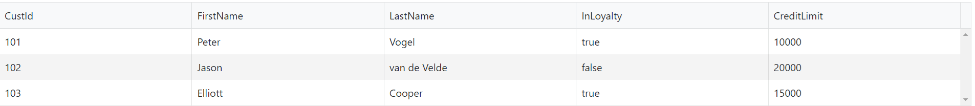
This markup displays four of the columns from the Customer object and prevents the user from editing the CustId column:
<kendo-grid name="CustomerGrid">

    <columns>
        <column field="CustId" editable="() => false" />
        <column field="FirstName" />
        <column field="LastName"/>
        <column field="CreditLimit"/>
    </columns>

    <datasource data="@Model.Customers"/>
</kendo-grid>
Enabling Changes
By default, the grid displays data in a read only mode. It’s easy, however, to enable the grid to support any of the scenarios a grid is used for.
Enterprise Application/Bulk Change
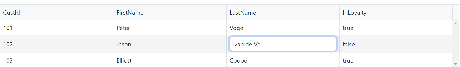
To support the enterprise batch/bulk editing scenario, you just need to add the editable element to your grid and set its mode attribute to "incell", like this:
<kendo-grid name="CustomerGrid">
    <editable mode="incell" />
    <columns>
      <column field="CustId" …
Now, when users click on any column in any row, they can change contents of the cell. This supports the scenario when the user needs to be able to change multiple rows in a batch of records and even multiple cells in those rows.
Line of Business Updates
In this scenario the user typically wants to update multiple columns for a selected row. To enable that, you just need to do two things:
- Add the editable element to the grid but set its mode attribute to
"inline". - Add a column element containing a commands element and, within that, a column-command element with its name attribute set to
"edit".
With those two changes in place, the user can select and update a single customer in the grid. In addition, all the columns in the row are enabled for update so the user can just tab across the row, making the necessary changes.
<kendo-grid name="CustomerGrid">
    <editable mode="inline" />
    <columns>
       <column>
            <commands>
                <column-command name="edit" />
            </commands>
      </column>
      <column field="CustId" …
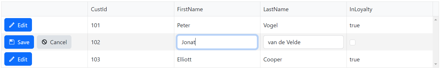
You can control the appearance of the command buttons that are generated for you through options on the column-command element (for example, the text attribute will let you change the caption on the button), by tweaking the CSS rules assigned to the button, or by creating a column template and adding your own HTML to that template.
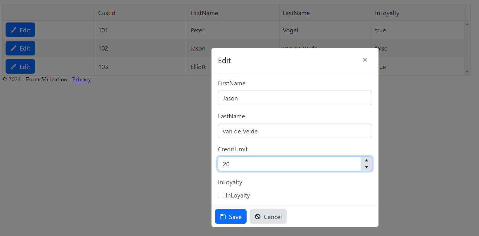
Editing in a Dialog
The next scenario is where the grid only displays a few of the properties for the related object—selecting the row opens a dialog box that allows all the properties to be updated. To enable that scenario, you need to do three things:
- Add the editable element but set its mode attribute to
"popup". - Add a column element containing a commands element and, within that, a column-command element with its name attribute set to
"edit". - Add the columns you want to display in the dialog to the grid but prevent them from being displayed in the grid by setting their hidden attribute set to “true” (these columns will be hidden in the grid but will be displayed in the dialog opened by the popup mode).
This example shows only the columns need to identify a customer and hides the rest in the grid (in this case, InLoyalty and CreditLimit are hidden). All of the columns (except for CustId which is not editable) are displayed in the dialog that appears when the user clicks the Edit button:
<kendo-grid name="CustomerGrid">
    <editable mode="popup" />
    <columns>
        <column>
            <commands>
                <column-command name="edit" />
            </commands>
        </column>
        <column field="CustId" editable="e => false" />
        <column field="FirstName" />
        <column field="LastName" />
        <column field="InLoyalty" hidden="true"/>
        <column field="CreditLimit" hidden="true"/>
Again, you can customize the appearance of all these UI elements, including designing your own editing dialog.
Deleting Rows
Supporting deleting rows requires two changes:
- Add the
editableelement to the grid with its enabled attribute set totrue. - Add a
commandselement with a command-column that has its name attribute set todestroy.
This markup lets the user delete Customers:
<kendo-grid name="CustomerGrid">
    <editable enabled="true" />
    <columns>
        <column>
            <commands>
                <column-command name="destroy" />
            </commands>
        </column>
        <column field="CustId" …
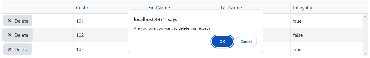
The kendo-grid even throws in an “Are you sure?” dialog to force the user to confirm the deletion (the user will still delete things by accident but, now, it’s their fault).
Adding Rows
Finally, to give the user the ability to add a new row to the grid, you just need to add the toolbar element to the grid, with a toolbar-button inside of it that has its name attribute set to create:
<kendo-grid name="CustomerGrid">
    <editable mode="popup"/>
     <toolbar>
         <toolbar-button name="create"/>
    <toolbar>
    <columns>
        <column field="CustId" …
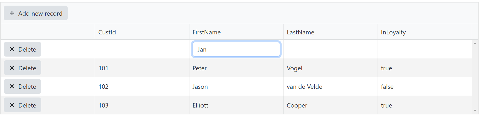
The user can add a new customer by clicking on the Add New Item dialog in the toolbar.
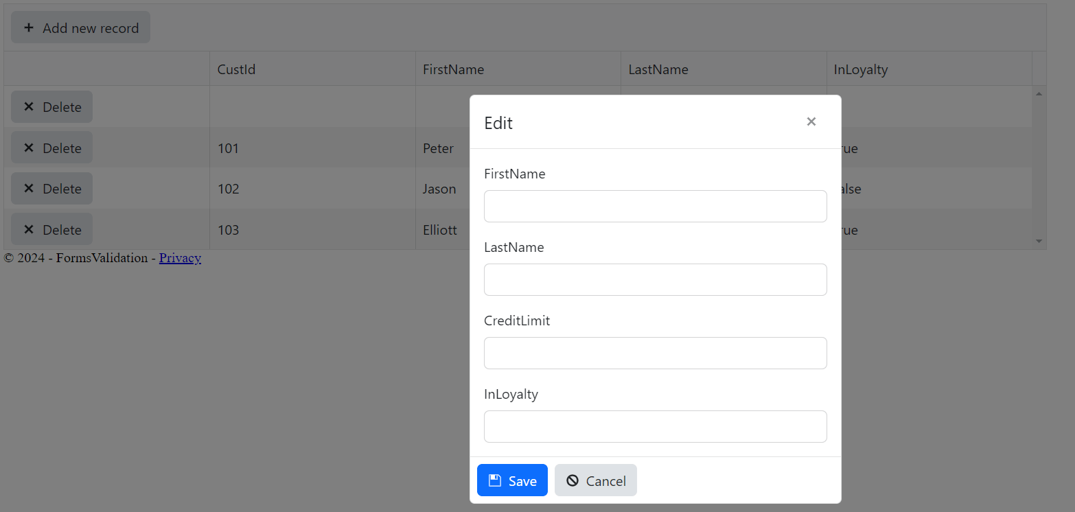
If there are enough properties associated with the object that editing a row in the middle of the grid is cumbersome, the kendo-grid will generate a form for the user. All you need to do is set the editable element’s mode attribute to popup.
<kendo-grid name="CustomerGrid">
    <editable enabled="true" mode="popup"/>
     <toolbar>
Now, when the user clicks the toolbar button to add a new row, the dialog box displaying all the editable properties will appear (if you want, once you add the mode attribute, you can remove the editable attribute).
Mixing and Matching
Most combinations of these features will also work. You can pile on these configurations to enable creating, deleting and editing selected rows on the same form using either the inline or popup modes.
The only real exception to that flexibility is the incell (batch editing) mode. That mode effectively disables selecting individual rows for editing (though you can use incell mode with delete and create). And, while you can combine incell mode with the create button, from a UX point of view, it isn’t a great combination: It forces the user to click on each cell in the new row in order to update the column—you’d be better off with either inline or popup mode. Finally, while you can use the popup mode with delete, it has no effect on the UX, so why bother unless you’re also using update or create?
You can also combine edit and delete buttons into a single column or put them in separate columns. This layout, for example, puts the edit and delete buttons in separate columns:
<columns>
    <column>
        <commands>
            <column-command name="edit" />
        </commands>
    </column>
    <column>
        <commands>
            <column-command name="destroy" />
        </commands>
    </column>
    <column field="CustId" editable="e => false" />
This layout, on the other hand, puts both buttons in a single column:
<columns>
    <column>
        <commands>
            <column-command name="destroy" />
            <column-command name="edit" />
        </commands>
    </column>
Having the two buttons in a single column takes up less screen space (though you can use the column’s width attribute to manage that and, if your column is narrow enough, the buttons are automatically stacked vertically). On the other hand, putting the two buttons in separate columns reduces the chance of users clicking one of the buttons accidentally and also lets you insert columns between the two buttons.
Integrating Code
You are probably already wondering about whether you can integrate your own custom code into this process. Well, you can—but, as usual, you’ll need to consider how you’ll test that code.
For example, you can use the editable attribute to control whether a column can be updated based on other data in the same row. All you need to do is have the function you put in the editable attribute accept a parameter. The grid will load that parameter with a copy of the object displayed on the row, giving you access to other properties on the object.
If, for example, you wanted to prevent a customer’s credit limit from being changed if the customer is in the loyalty program, you could update the column’s enabled function to this to prevent CreditLimit from being editable when InLoyalty is true:
<column field="CreditLimit" editable="(c) => c.InLoyalty"/>
This example prevents the user from updating the InLoyalty column unless the customer’s credit rating is at least $15,000:
<column field="InLoyalty" editable="(c) => c.CreditLimit > 15000" />
Once you start adding code, though, you have the opportunity to add bugs: You need to consider all the scenarios you’re implementing and how you’ll test them.
If, for example, you use that code to control when your InLoyalty property can be updated and you’ve configured your grid to support adding a new customer, then you need to consider that all the properties on a brand-new customer are going to be set to null. That editable check on the customer’s credit limit is going always return false when adding a new customer and users won’t be able to set the InLoyalty property. That may be what you want … or not.
If you do want to let users set InLoyalty on new customers, then this editable code would be what you need to handle editing InLoyalty for both edits and adds:
        <column field="InLoyalty"
                            editable="(c) => c.CreditLimit == null || c.CreditLimit > 15000" />
Still, while code requires care (and testing), it can be useful. In my next post, I’ll show how you some of the ways you can integrate your own code into the kendo-grid’s update process.
Not yet using Telerik UI for ASP.NET Core? It comes with a free 30-day trial, so check it out!
Peter Vogel
Peter Vogel is both the author of the Coding Azure series and the instructor for Coding Azure in the Classroom. Peter’s company provides full-stack development from UX design through object modeling to database design. Peter holds multiple certifications in Azure administration, architecture, development and security and is a Microsoft Certified Trainer.
Related Posts
Comments
All articles
Topics
Web MobileMobile
Desktop
Design
Productivity
People
