Deep Dive into the New .NET MAUI Blazor Hybrid and Web App Solution Template

Summarize with AI:
Get started now with the .NET MAUI Blazor Hybrid and Web App template, allowing you to reuse components in web and mobile projects.
We are around the corner from the official .NET 9 version release during .NET Conf 2024, bringing with it several important announcements and new features.
One of the new features that will surely please many developers is the new .NET MAUI Blazor Hybrid and Web App template, which will allow you to reuse components in web and mobile projects. In this article, I’m going to tell you what this new template is about and how you can start using it for your future projects. Let’s get started!
How to Get the New .NET MAUI Blazor Hybrid and Web App Template?
Undoubtedly, the first step you should take is to get the new template to experiment with it. The easiest way to do this is through the preview version of Visual Studio 2022, which contains the preview versions of future .NET versions.
An important thing to know is that when you install the Preview version, this installation will not interfere with other Visual Studio installations you have, so it is a safe process to perform.
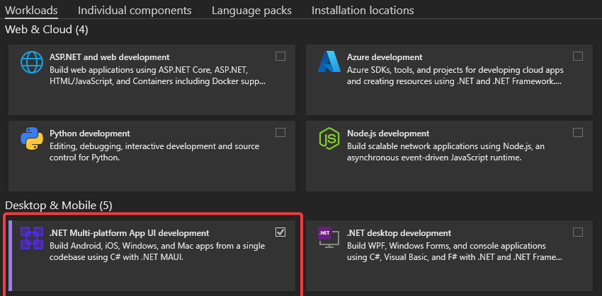
The installer is the same as Visual Studio 2022, you just need to make sure to select the .NET MAUI Multi-platform App UI development workload, as seen in the following image:
When the installation process is finished, you will be ready to explore the newly installed template.
Template Overview
Once the preview version of Visual Studio 2022 has been installed, you can start the process to create a new project, which will display the available templates according to the workloads selected in the installation. An easy way to find the new template is by filtering it through the Blazor Hybrid project type, as seen below:
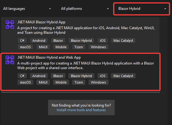
The next step is to select the template to configure the name and location of the solution, to later move on to the Additional Information window.
This is a common configuration window in Blazor projects, which allows you to select the Framework version, if you want to use HTTPS, the Interactive rendering mode, among other properties. In my case, I will leave the default values as seen below:
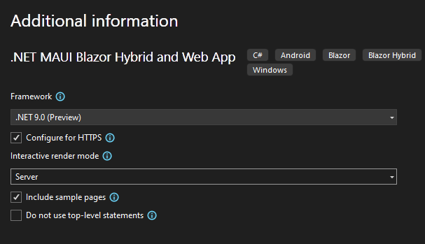
With this information, you can click on the Create button to create the new project.
Once the solution has been created, you will see that it is composed of three projects, unlike a .NET MAUI Blazor Hybrid App project that only consisted of a single project.
Template Structure
Let’s look a little more in detail at the projects that have been created with this new template.
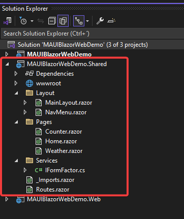
First, we have a project with the .Shared ending. This project is the one that will allow us to create and host components that can be shared for both the .NET MAUI application and the Blazor project. This is a great advantage in the .NET development world, as for the first time we will be able to create projects that target both mobile devices and web browsers while reusing code to the maximum through Razor components.
In the example project, you can see that this component contains the application Layouts, a set of Razor pages, the routing file and the definition of the IFormFactor interface, which will be reused from the other projects:
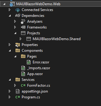
Secondly, we see a project with the .Web ending. This project is the Blazor project that we can run in a web browser through the interactive rendering mode selected in the configuration screen.
Within this project, you can see components specific to the Blazor project, such as the file that serves as an entry point App.razor, the error handling component Error.razor and the initialization file Program.cs. Additionally, you can notice that there is also a reference to the Shared project in the dependencies section:
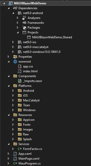
Lastly, the project that has the same name as the solution (unless you have changed the project name) is the .NET MAUI project. This project has configurations to target different platforms such as Android, iOS, Windows, among others.
In this project, we can notice some interesting things, like the fact that there is a folder called wwwroot with the files index.html and app.css, which serve to render the Blazor components. Additionally, there is a reference to the Shared project from each library of each platform (in the image below I show only the Android one), as well as a Components folder where we could add components specific to the mobile project:
Operation of the Example Project
Now that you know how the example project is composed, let’s examine in more depth how you can access the features of each platform thanks to the sample code.
Earlier, I mentioned that the Shared project defines an IFormFactor interface that has the following structure:
public interface IFormFactor
{
    public string GetFormFactor();
    public string GetPlatform();
}
It is this interface that defines which methods will be implemented on each platform, both Blazor and .NET MAUI.
In the Blazor project, you can see that within the Services folder there is a FormFactor.cs file, which looks like this:
public class FormFactor : IFormFactor
{
    public string GetFormFactor()
    {
        return "Web";
    }

    public string GetPlatform()
    {
        return Environment.OSVersion.ToString();
    }
}
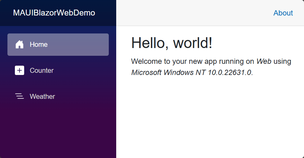
This class returns a string with the value Web through the GetFormFactor method to represent that we are running the Blazor project, in addition to getting the operating system version through the OSVersion property in the GetPlatform method.
On the other hand, in the .NET MAUI project within the Services folder there is also a FormFactor class that has the following structure:
public class FormFactor : IFormFactor
{
    public string GetFormFactor()
    {
        return DeviceInfo.Idiom.ToString();
    }

    public string GetPlatform()
    {
        return DeviceInfo.Platform.ToString() + " - " + DeviceInfo.VersionString;
    }
}
In this class, we use the DeviceInfo class, which allows obtaining information about the platform on which the application is being executed. In this example, the Idiom property is used in the GetFormFactor method to know on what type of device the application is running. And within the GetPlatform method, the Platform and VersionString properties are used to know the operating system and its respective version.
When running the Blazor application, we get the following result:
On the other hand, if we select the .NET MAUI project as initial and specify a startup platform, for example Android, we will get the following result:
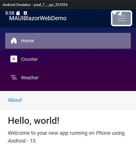
Undoubtedly, being able to reuse components between both platforms is exciting and will encourage more developers to go this route to deploy their solutions on the most well-known and used platforms today.
Creating an Image Generator App with the Flux Model Sharing Telerik Components in Blazor and .NET MAUI
The time has come to get to work to create an interesting image generator project, using the FLUX.1 schnell model, which is super realistic and powerful. Additionally, we are going to use Progress Telerik UI components, which allow us to use pre-created controls for simple and agile development.
To start, you must create a new project by selecting the .NET MAUI Blazor Hybrid and Web App template. Next, we are going to focus on configuring the Shared project.
Configuring the Shared Project to Add the Image Generator Component
Once we have created the new project, we are going to add the reference of the Telerik controls to the .Shared project, according to one of the installation methods. In my case, I have chosen to add the Telerik NuGet package to the project.
Next, we open the _Imports.razor file to add the global namespaces and not have to be referencing them in each component, ending up as follows:
@* required *@
@using Telerik.Blazor // set component parameters
@using Telerik.Blazor.Components // recognize components tags
@using Telerik.SvgIcons // use SVG icons
@using Telerik.FontIcons // use font icons

@* optional *@
@using Telerik.DataSource // implement data-related programmatic customizations
@using Telerik.DataSource.Extensions // use OnRead events and ToDataSourceResult()
With the namespace file ready, the next step is to create our own Razor Component, which you can add through a right-click on the Pages folder in the project with the .Shared ending | Add | Razor Component. I have called the new component FluxGenerator, but you can name it whatever you want.
Creating the New Component
Once the new component is created, replace it with the following code:
@page "/flux"
@using System.Text.Json
@using System.Net.Http.Headers
@using System.Text
@using Telerik.Blazor.Components

<div class="container py-5">
    <h1 class="text-center mb-5">AI Image Generator</h1>
    <div class="row justify-content-center">
        <div class="col-lg-8">
            <div class="card custom-shadow">
                <div class="card-body">
                    <div class="mb-4">
                        <label for="prompt" class="form-label">Describe the image you want to generate:</label>
                        <textarea class="form-control" id="prompt" rows="3" @bind="prompt" placeholder="E.g.: A cat astronaut floating in space with Earth in the background"></textarea>
                    </div>
                    <div class="d-grid">
                        <button class="btn btn-primary btn-lg" type="button" id="generateBtn" @onclick=GenerateImage disabled="@isLoading">Generate Image</button>
                    </div>
                </div>
            </div>
            <div class="card mt-4 custom-shadow">
                <div class="card-body">
                    <h5 class="card-title mb-3">Generated Image</h5>
                    <div class="text-center">
                        @if (isLoading)
                        {
                            <TelerikLoader Visible="@isLoading"
                                           Size="@ThemeConstants.Loader.Size.Large"
                                           ThemeColor="@ThemeConstants.Loader.ThemeColor.Tertiary"
                                           Type="@LoaderType.ConvergingSpinner" />
                        }
                        else if (!string.IsNullOrEmpty(imageUrl))
                        {
                            <div class="flex-center">
                                <TelerikCard>
                                    <CardImage Src="@imageUrl"></CardImage>
                                    <CardBody>
                                        <CardTitle>Used prompt:</CardTitle>
                                        <CardSeparator></CardSeparator>
                                        <p>@prompt</p>
                                    </CardBody>
                                    <CardActions Layout="@CardActionsLayout.Stretch">
                                        <TelerikButton FillMode="@(ThemeConstants.Button.FillMode.Flat)" Icon="@SvgIcon.HeartOutline">Like</TelerikButton>
                                        <TelerikButton FillMode="@(ThemeConstants.Button.FillMode.Flat)">Share</TelerikButton>
                                        <TelerikButton FillMode="@(ThemeConstants.Button.FillMode.Flat)">Read More</TelerikButton>
                                    </CardActions>
                                    <CardFooter Class="k-hbox justify-space-between">
                                        <span>Created by @@hprez</span>
                                        <span>@DateTime.Now.ToShortDateString()</span>
                                    </CardFooter>
                                </TelerikCard>
                            </div>
                        }
                        else
                        {
                            <p>No image generated yet.</p>
                        }
                    </div>
                </div>
            </div>

        </div>
    </div>
</div>

@code {
    private string prompt = "";
    private string imageUrl = "";
    private bool isLoading = false;
    private DateTime StartDate = new DateTime(2019, 5, 2);
    private DateTime Min = new DateTime(2015, 1, 1);
    private DateTime Max = new DateTime(2025, 12, 31);
    private async Task GenerateImage()
    {

        isLoading = true;
        var apiKey = "api-key"; // Replace with your actual API key
        var apiUrl = "https://api.together.xyz/v1/images/generations";
        var client = new HttpClient();

        var requestData = new
        {
            model = "black-forest-labs/FLUX.1-schnell",
            prompt = prompt,
            width = 1024,
            height = 768,
            steps = 4,
            n = 1,
            response_format = "b64_json"
        };

        var requestContent = new StringContent(JsonSerializer.Serialize(requestData), Encoding.UTF8, "application/json");
        client.DefaultRequestHeaders.Authorization = new AuthenticationHeaderValue("Bearer", apiKey);

        var response = await client.PostAsync(apiUrl, requestContent);
        if (response.IsSuccessStatusCode)
        {
            var responseContent = await response.Content.ReadAsStringAsync();
            var jsonResponse = JsonDocument.Parse(responseContent);
            var base64Image = jsonResponse.RootElement.GetProperty("data")[0].GetProperty("b64_json").GetString();
            imageUrl = $"data:image/png;base64,{base64Image}";
        }
        else
        {
            Console.WriteLine("Error generating image: " + response.ReasonPhrase);
        }
        isLoading = false;
    }
}
<style>
    .justify-space-between {
        justify-content: space-between;
    }
</style>
With the above code ready, go to the together site and create an account, which will give you an API access key for three months of unlimited and free use, enough time to play with the API. Once you have your API key ready, replace the value of the apiKey variable with your key, which will allow you to connect to the service.
Finally, go to the file located in Layout | NavMenu.razor and add the following section within the div with the class nav-scrollable:
<div class="nav-scrollable" onclick="document.querySelector('.navbar-toggler').click()">
    <nav class="flex-column">
        ...
        <div class="nav-item px-3">
            <NavLink class="nav-link" href="flux">
                <span class="bi bi-list-nested-nav-menu" aria-hidden="true"></span> Flux Generator
            </NavLink>
        </div>
    </nav>
</div>
With this, we finish the configuration of the Shared project.
Configuring the Blazor Project
For the Blazor project to work correctly, we need to modify the file located in Components | App.razor, adding the following to the head tag:
<head>
    ...
    <link rel="stylesheet" href="_content/Telerik.UI.for.Blazor/css/kendo-theme-default/all.css" />
    <link rel="stylesheet" href="css/app.css" />
    <!-- CSS isolation stylesheet -->
    <link rel="stylesheet" href="AppName.styles.css" />
    <script src="_content/Telerik.UI.for.Blazor/js/telerik-blazor.js" defer></script>
    <HeadOutlet @rendermode="InteractiveServer" />
</head>
On the other hand, in the body tag we will add the following:
<body>
    ...
    <script>
        document.addEventListener("DOMContentLoaded", function () {
           Blazor.start();
        });
    </script>
</body>
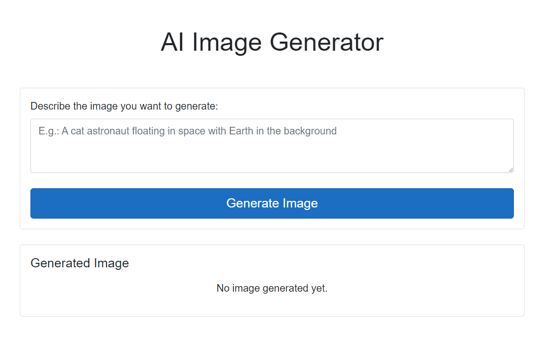
With this change, if we start the application, we will see a screen that asks us for a prompt to generate the image:
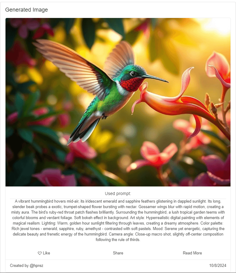
By entering a prompt and clicking on the Generate Image button, a super realistic image is generated in just a couple of seconds:
Now, let’s move on to configuring the .NET MAUI project.
Configuring the .NET MAUI Project
It’s time to configure the .NET MAUI project. In this case, we need to open the file located in wwwroot | index.html.
In the head section, we’re going to add the following lines:
<head>
    ...
    <link rel="stylesheet" href="_content/Telerik.UI.for.Blazor/css/kendo-theme-default/all.css" />
    <!-- CSS isolation stylesheet -->
    <link rel="stylesheet" href="AppName.styles.css" />
    <script src="_content/Telerik.UI.for.Blazor/js/telerik-blazor.js" defer></script>
</head>
In the body section there’s no need to add anything, so we won’t touch it. With these changes, we can start the project and enter a prompt:
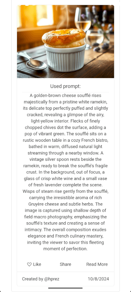
As you can see, we have the same behavior on a mobile device reusing the Blazor component.
Conclusion
In this post, you’ve been able to learn in detail about the .NET MAUI Blazor Hybrid and Web App template. Similarly, we’ve created a project that allows you to generate images using AI in an instant, which combined with the use of Telerik controls to allow the creation of apps in a fast and robust way.
Try out the full suite of Telerik DevCraft UI component suite free for 30 days.

Héctor Pérez
Héctor Pérez is a Microsoft MVP with more than 10 years of experience in software development. He is an independent consultant, working with business and government clients to achieve their goals. Additionally, he is an author of books and an instructor at El Camino Dev and Devs School.

