
Creating Consistent Text Styling with the KendoReact Typography Component

Summarize with AI:
Consistent text styling is crucial for maintaining the readability and aesthetic appeal of an application. It helps an application’s text be legible, accessible and visually harmonious across different sections.
In this article, we’ll delve into how we can utilize the Progress KendoReact Typography component to create consistent text styling in our React applications.
The KendoReact Typography Component
The KendoReact Typography component provides a comprehensive set of text elements, including headings, paragraphs and code snippets that can adhere to the design principles of an application’s theme.
The Typography component is available through the @progress/kendo-react-common package and can be imported directly into a React project.
import { Typography } from '@progress/kendo-react-common';
To apply the Typography component, we can choose from the various sub-components it supports, such as h1, h2, p, code and others. Here’s an example of rendering different header titles using the Typography component.
import * as React from "react";
import { createRoot } from "react-dom/client";
import { Typography } from "@progress/kendo-react-common";
const App = () => {
return (
<React.Fragment>
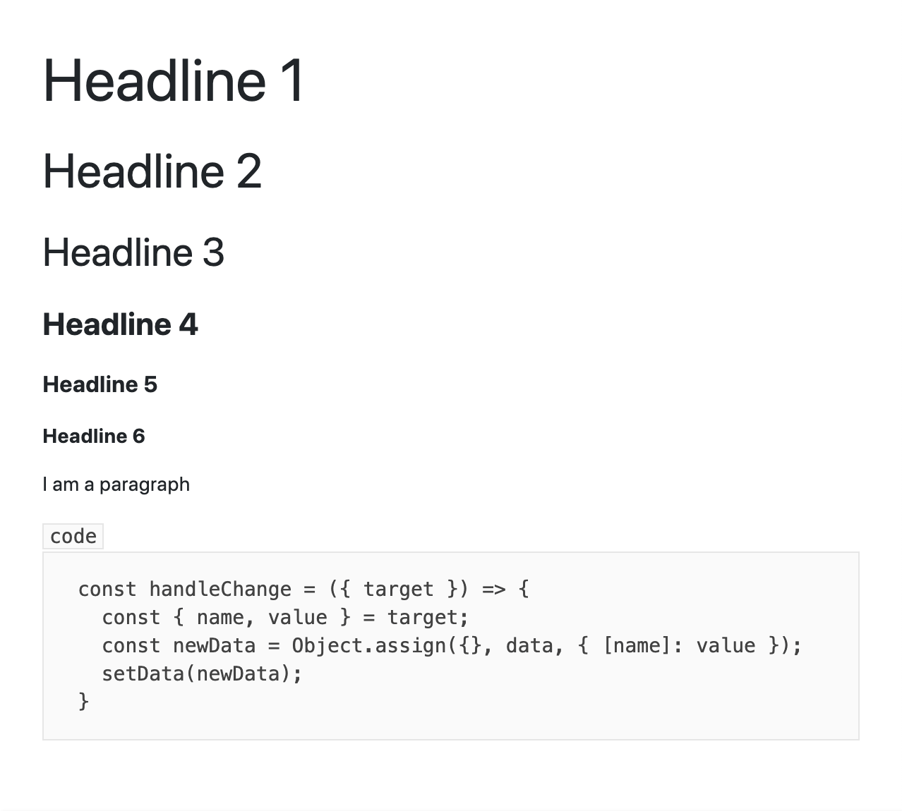
<Typography.h1>Headline 1</Typography.h1>
<Typography.h2>Headline 2</Typography.h2>
<Typography.h3>Headline 3</Typography.h3>
<Typography.h4>Headline 4</Typography.h4>
<Typography.h5>Headline 5</Typography.h5>
<Typography.h6>Headline 6</Typography.h6>
</React.Fragment>
);
};
const container = document.querySelector("my-app");
const root = createRoot(container);
root.render(<App />);
The above code demonstrates the use of the KendoReact Typography component to render various header titles, ranging from h1 to h6. Each header level is styled appropriately according to the predefined styles of the KendoReact theme being used, keeping visual hierarchy and consistency across the application’s typography.
Alternatively, we can render a paragraph by using the Typography.p sub-component. This allows us to apply the same consistent styling principles to paragraph text:
import * as React from "react";
import { createRoot } from "react-dom/client";
import { Typography } from "@progress/kendo-react-common";
const App = () => {
return (
<React.Fragment>
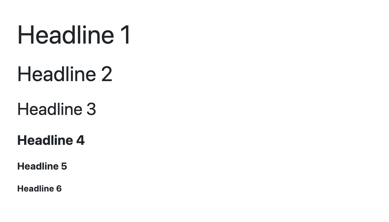
<Typography.p>
I am a paragraph. This text is styled using the KendoReact Typography
component, demonstrating how easy it is to apply consistent text styling
throughout your React application.
</Typography.p>
</React.Fragment>
);
};
const container = document.querySelector("my-app");
const root = createRoot(container);
root.render(<App />);
The above will render a paragraph with the help of the Typography component.
For showcasing code snippets within our text, the Typography.code and Typography.pre sub-components offer a clean and consistent way to display inline and block code elements, respectively.
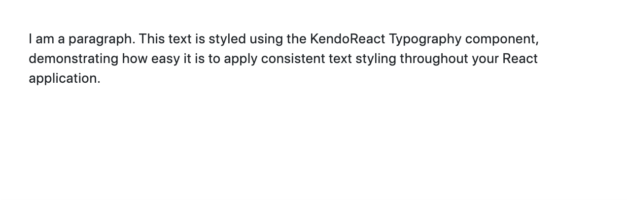
The Typography.code sub-component is ideal for displaying short, inline code snippets within a paragraph or sentence.
import * as React from "react";
import { createRoot } from "react-dom/client";
import { Typography } from "@progress/kendo-react-common";

const App = () => {
  return (
    <React.Fragment>
      <Typography.p>
        To install the package, run the{" "}
        <Typography.code>npm install</Typography.code> command in your terminal.
      </Typography.p>
    </React.Fragment>
  );
};

const container = document.querySelector("my-app");
const root = createRoot(container);
root.render(<App />);
The above code snippet demonstrates how Typography.code can be used within a paragraph to highlight the npm install command as a code element, making it stand out for emphasis.
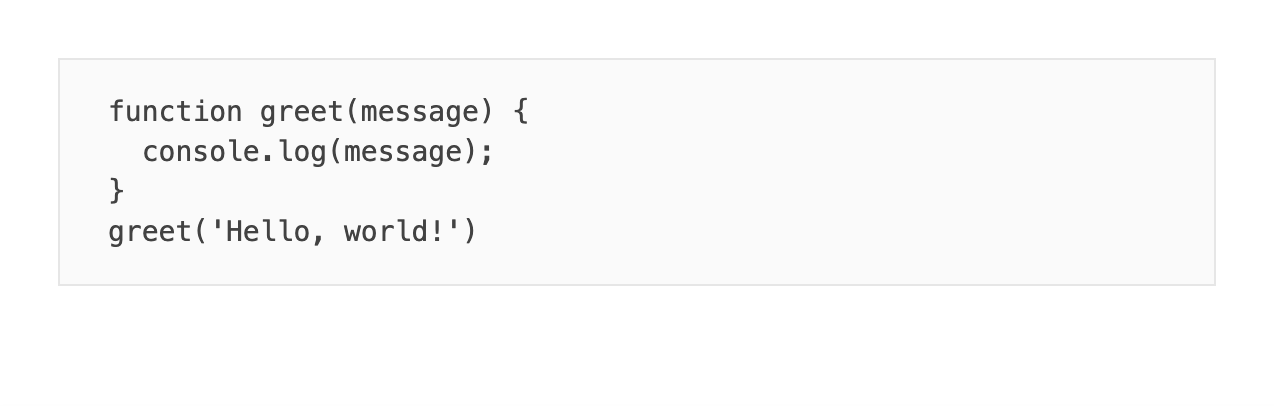
For larger code examples or snippets that should be displayed as a block, the Typography.pre sub-component provides an appropriate styling option. This presents the code in a formatted and easy-to-read manner, preserving whitespace and indentation.
import * as React from "react";
import { createRoot } from "react-dom/client";
import { Typography } from "@progress/kendo-react-common";

const App = () => {
  return (
    <React.Fragment>
      <Typography.pre
        dangerouslySetInnerHTML={{
          __html: `function greet(message) {
  console.log(message);
}
greet('Hello, world!')`,
        }}
      />
    </React.Fragment>
  );
};

const container = document.querySelector("my-app");
const root = createRoot(container);
root.render(<App />);
Note that dangerouslySetInnerHTML is a React property that allows you to set HTML directly from React. It should be used with caution to reduce the risk of cross-site scripting (XSS) vulnerabilities when rendering user-generated content.
The above code example uses the Typography.pre sub-component to render the block of code while maintaining the formatting, indentation and line breaks.
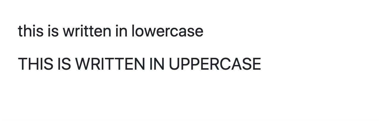
The KendoReact Typography component not only helps in rendering text elements but also offers customization options through various props. For example, the textTransform prop allows us to set the text transformation of the element in either uppercase, lowercase or capitalize.
import * as React from "react";
import { createRoot } from "react-dom/client";
import { Typography } from "@progress/kendo-react-common";

const App = () => {
  return (
    <React.Fragment>
      <Typography.h3 textTransform="lowercase">
        This is written in lowercase
      </Typography.h3>
      <Typography.h3 textTransform="uppercase">
        This is written in uppercase
      </Typography.h3>
    </React.Fragment>
  );
};

const container = document.querySelector("my-app");
const root = createRoot(container);
root.render(<App />);
The above code will display headings displayed in both lowercase and uppercase transformations.
Here’s an example of rendering text in different colors by using the themeColor property to specify the color of the text to certain possible values.
import * as React from "react";
import { createRoot } from "react-dom/client";
import { Typography } from "@progress/kendo-react-common";

const App = () => {
  return (
    <React.Fragment>
      <Typography.h3 themeColor="inherit">Inherit text color</Typography.h3>
      <Typography.h3 themeColor="primary">Primary text color</Typography.h3>
      <Typography.h3 themeColor="info">Info text color</Typography.h3>
      <Typography.h3 themeColor="success">Success text color</Typography.h3>
      <Typography.h3 themeColor="error">Error text color</Typography.h3>
      <Typography.h3 themeColor="warning">Warning text color</Typography.h3>
      <Typography.h3 themeColor="light">Light text color</Typography.h3>
    </React.Fragment>
  );
};

const container = document.querySelector("my-app");
const root = createRoot(container);
root.render(<App />);
With the above, we’ll see each of the headings rendered in the theme’s inherit, primary, info, success, error, warning and light colors. Keep in mind the specific color being applied depends on the overall KendoReact theme selected.

For a list of all the customization properties the Typography component accepts, refer to the TypographyProps API documentation.
Wrap-up
The Typography component from KendoReact enables us to maintain consistent text styling across our application by keeping all text elements visually harmonious and accessible. By leveraging its comprehensive suite of sub-components and customization options, developers can create a cohesive text styling strategy that enhances the user experience and aligns with their application’s design principles.
For more details, be sure to check out the official component documentation!

Hassan Djirdeh
Hassan is a senior frontend engineer and has helped build large production applications at-scale at organizations like Doordash, Instacart and Shopify. Hassan is also a published author and course instructor where he’s helped thousands of students learn in-depth frontend engineering skills like React, Vue, TypeScript, and GraphQL.
Related Posts
Comments
All articles
Topics
Web MobileMobile
Desktop
Design
Productivity
People
