
KendoReact
What's New R3 2023
What's New HistoryNew Component: React Pyramid Chart
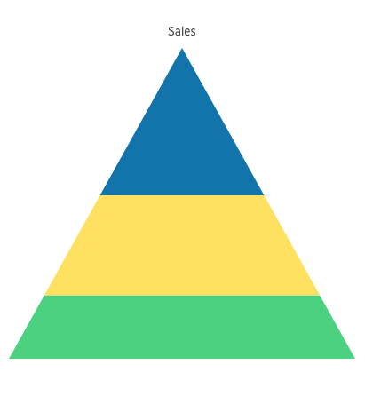
The KendoReact Pyramid Chart visualizes data within a pyramidal structure organized into horizontal segments. The specific chart shape facilitates a different size for each section, effectively illustrating the hierarchy of topics based on the width of each section.
See the React Pyramid Chart demo
New Component: React OrgChart
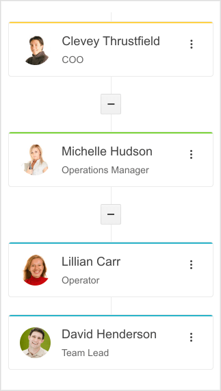
The new KendoReact OrgChart enables users to easily view and interact with an organizational structure (e.g. navigate to specific people or positions of interest). The chart features a tree-like arrangement where users can edit the individual items, change the item's parent, or group the nodes within the tree. It is ideal showcasing team memberships and reporting structures.
React Grid: Tabbed Column Menu and Selection Aggregates
The KendoReact Data Grid now offers a tabbed column menu, offering improved flexibility and a better user experience when managing column settings within the grid.
See the React Grid Tabbed Column Menu demo
The Selection Aggregates, on the other hand, enable you to select single or multiple cells or rows withing the grid and calculate different metrics based on the selected data. This feature enables you to get a quick snapshot of key aggregates for the selected data. You can utilize the built-in approach and display the metrics at the bottom of the Grid or create your own elements to present the data as needed.
See the React Grid Selection Aggregates demo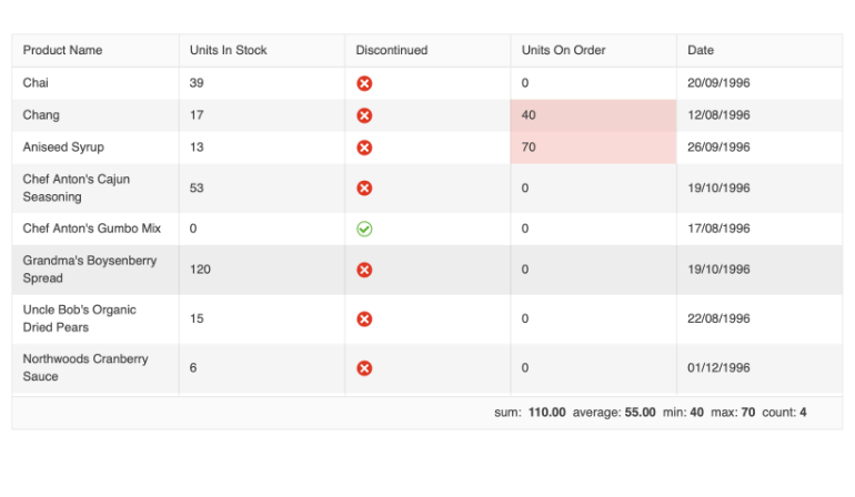
React GridHelper
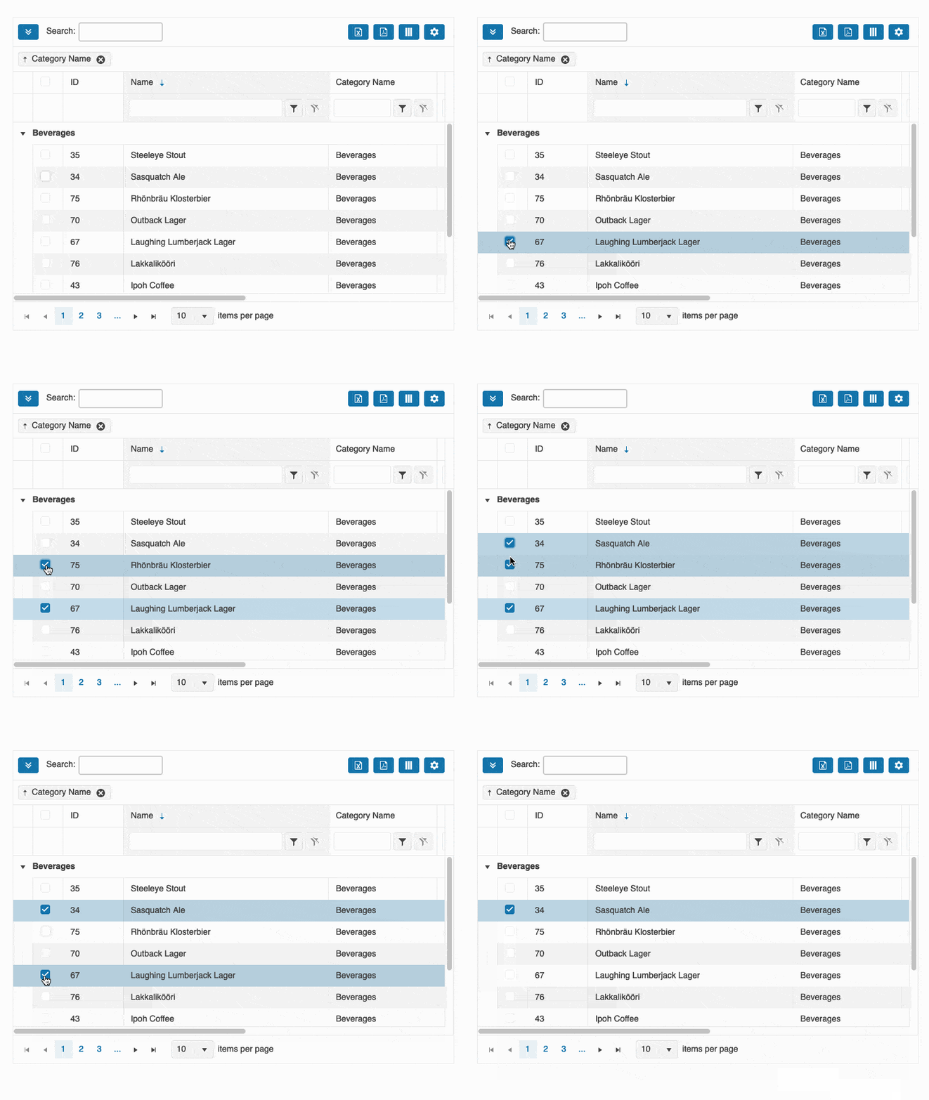
The new GridHelper enhances the capabilities of KendoReact Data Grid by providing a built-in feature for data operations, common functionalities, and extensive customization options for end-users, such as column hiding and PDF/Excel export and more.
React Spreadsheet: Multiple Enhancements
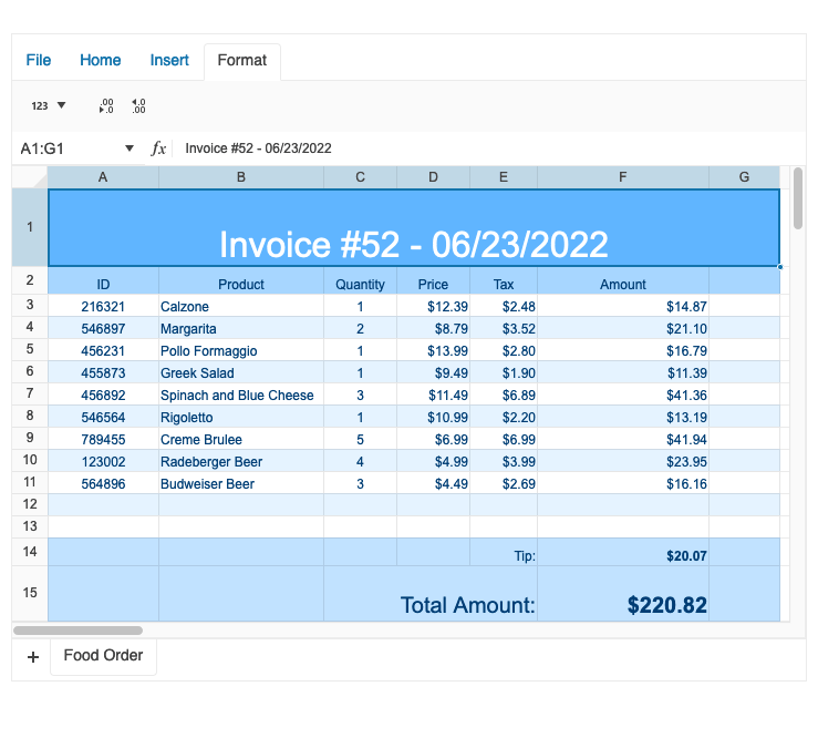
The KendoReact SpreadSheet continues to evolve and improve. Based on your feedback, we're introducing a range of new features in this release, including:
- Еnhanced editing and formatting tools
- Ability to create custom functions
- Support for error handling
See the React Spreadsheet Custom Functions demo
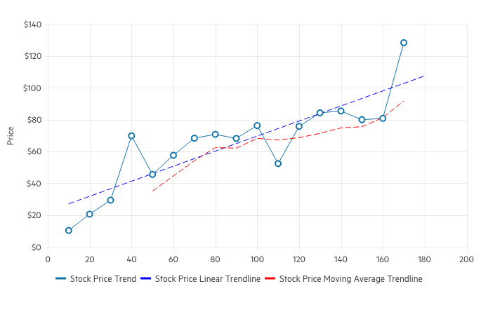
React Charts: Trendlines
The KendoReact Charts now support Trendlines – automatically generated indicators that illustrate data trends over time. The linear trendline, for example, demonstrates if a particular quantity is increasing or decreasing over time. The moving average trendline, on the other hand, is used to smooth out the variations in data by averaging all points in a certain period of time.
See the React Charts Trendlines demo
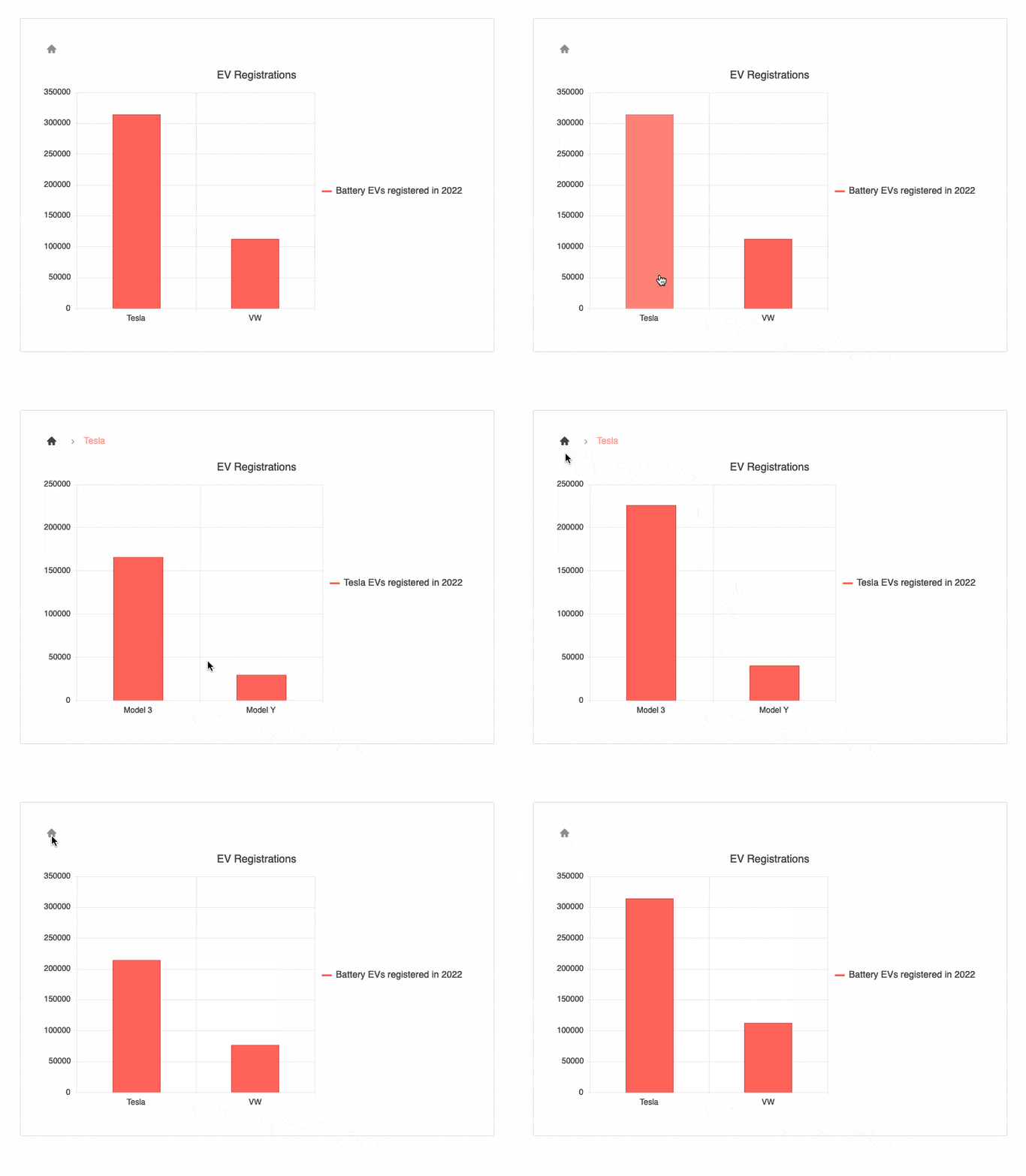
React Charts: Drill Down to More Detailed Data
he KendoReact Charts are now enriched with a drill-down functionality, enabling users to deep dive into specific data. With the drill-down feature, users can easily click on a specific chart element, such as bar or pie segment, and navigate to a detailed view containing more information about the selected item (e.g. breakdown by product).
See the React Charts Drill-down demo
React Gantt: Redesigned Popup Edit Form
We have redesigned the KendoReact Gantt Chart’s popup editor for a better experience. You now have more options when editing tasks, dependencies, and resources.
See the React Gantt Chart Editing demo

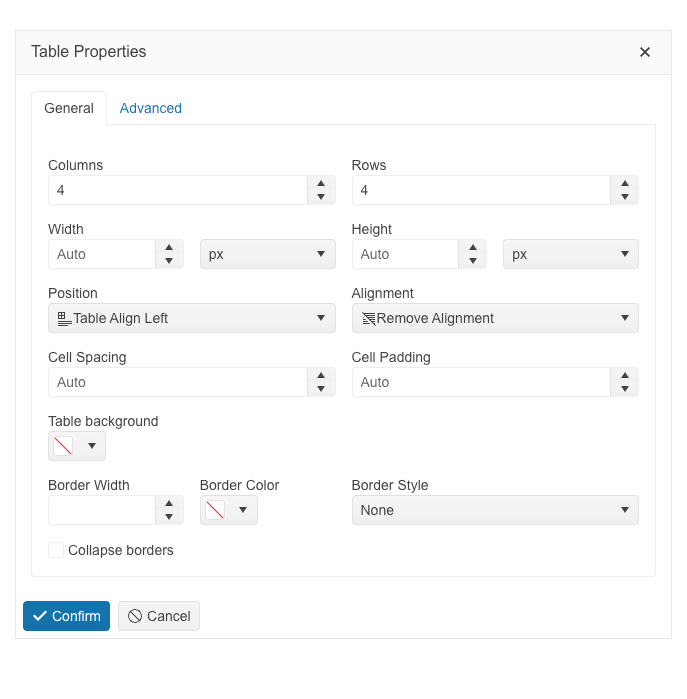
React Editor: Table and Cell Settings Panel
With the latest update, you can benefit from seamless control over your table design and accessibility options within the component. The new enhancements include:
-
Table wizard with multiple options for easy table customization
-
Enhanced accessibility tab with different customization options
-
Cell properties dialog for easy customized of the different cell settings
See the React Editor Table Editing demo
React Timeline: Horizontal Mode
Now you have the flexibility to display the timeline events horizontally for a neat, structured view, and optimal use of the page space.
See the React Timeline Horizontal Mode demo
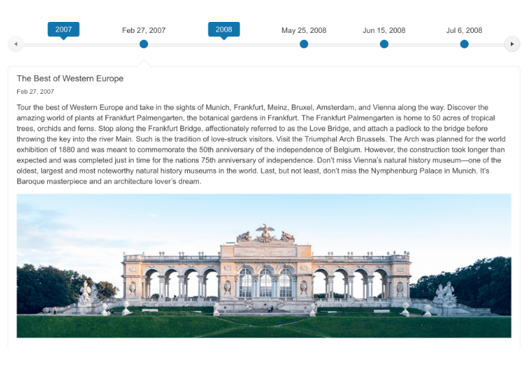
React Timeline: Keyboard Navigation
The React Timeline component is now enhanced with keyboard navigation capability, enabling users to easily navigate between the timeline items. This addition enhances the component’s usability and accessibility, ensuring a smooth user experience for all users.
See the React Timeline Keyboard Navigation demo

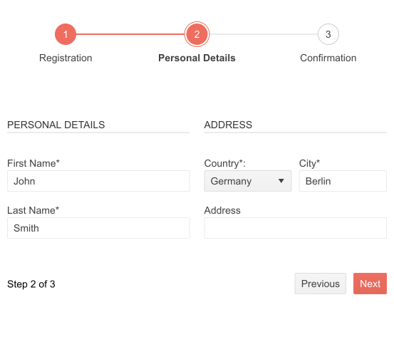
React Form Enhancement: Wizard Form
Now you have the flexibility to utilize a Wizard Form – a multi-step form consisting of one or more steps, each containing a set of controls and the ability to have its own layout. It enables users to enter their information in a few steps, leading to a more user-friendly experience and higher conversion rates.
See the React Wizard Form demo
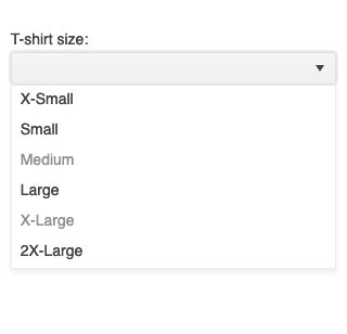
React DropDowns: Support for Disabled Items
The KendoReact DropDown components now provide the possibility to disable certain items. Once an item is disabled, it cannot be selected as a value for the component, but it might still remain focusable or non-focusable when navigating through the items using the keyboard.
See the React DropDownList Disabled Items demo as an example
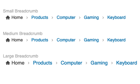
React Breadcrumb: Sizing
The React Breadcrumb component now enables you to choose between several predefined options (small, medium and large) to change its size.
See the React Breadcrumb Size demo
React Map: Pin Icons SVG Rendering
The KendoReact Map component now enables you to easily incorporate custom SVG icons to pinpoint specific locations on your map, thereby enhancing the customization of your mapping experience.
Accessibility Improvements Across Telerik and Kendo UI
We continue our efforts to improve the overall accessibility of Telerik and Kendo UI web components, now ensuring compliance with WAI-ARIA, Section 508, WCAG, including the just released WCAG 2.2 standard. Being compliant with the new WCAG 2.2 standard means that Telerik and Kendo UI products have covered the mandatory requirements for Minimum Target Size and Navigable Guidelines through default theme accessibility swatch and large size of our components. To meet the Dragging Movement Criteria, we have flexible APIs or built-in functionality. Check out the blog post highlighting what’s new in WCAG 2.2.

Keyboard Navigation Utilities
Now you can benefit from a new utility component designed to streamline accessibility. Now you can easily integrate keyboard navigation into any component, including custom ones, ensuring enhanced accessibility across your entire React app.
Strict Content Security Policy (CSP) Compliance
One of our goals in 2023 was to improve the Telerik and Kendo UI products’ quality, theming mechanism, and Content Security Policy (CSP) compliance. What strict CSP app settings do is prevent hackers from using HTML injection flaws to force the browser to execute a malicious script. This policy is especially effective against cross-site scripting attacks. Here is what we did so far to ensure strict CSP compliance in Kendo UI for Angular:
With R1 2023, we introduced and started incorporating SVG icons into the Kendo UI products.
With R2 2023, we changed the default type of icons in the Kendo UI libraries and components from font to SVG.
Now with R3 2023, we’re extracting the Font icons as a separate package and detaching the inline font declaration from the Kendo UI themes.
The themes will continue to support both font and SVG icons in components, thus allowing you to decide which type of icons to take advantage of. However, using the font icons will require a separate stylesheet to be referenced by clients.
This third and last step allows us to provide customers with a more secure and efficient icon system and the option to load and reference only needed resources.
Check out the dedicated blog post to find more information on the strategy for improving Telerik and Kendo UI web component libraries by moving from font to SVG icons.
Enhanced Design System Documentation
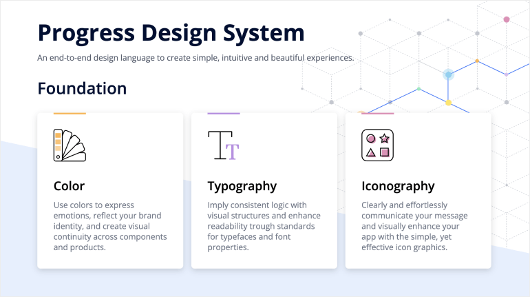
One of the key release items in R2 2023 was the launch of a dedicated Design System documentation site, which offers a wide range of resources, design assets and front-end documentation specifically tailored for the Telerik and Kendo UI libraries. With R3 2023, we have expanded Design System Support by having more components like MultiSelectTree, DateInput, ChipList, Window, Dialog, Editor, ListView, ListBox, MultiColumnComboBox, Filter, etc. meticulously detailed in the Design System documentation.
Our ongoing dedication is to expand this site further, aiming to provide you with all the necessary tools to craft seamless and visually captivating digital experiences and design systems utilizing the power of Telerik and Kendo UI component libraries.
KendoReact - R3 2023
- New Component: React Pyramid Chart
- New Component: React OrgChart
- React Grid: Tabbed Column Menu and Selection Aggregates
- React GridHelper
- React Spreadsheet: Multiple Enhancements
- React Charts: Trendlines
- React Charts: Drill Down to More Detailed Data
- React Gantt: Redesigned Popup Edit Form
- React Editor: Table and Cell Settings Panel
- React Timeline: Horizontal Mode
- React Timeline: Keyboard Navigation
- React Form Enhancement: Wizard Form
- React DropDowns: Support for Disabled Items
- React Breadcrumb: Sizing
- React Map: Pin Icons SVG Rendering
- Accessibility Improvements Across Telerik and Kendo UI
- Keyboard Navigation Utilities
- Strict Content Security Policy (CSP) Compliance
- Enhanced Design System Documentation


