
Improved Telerik UI for JSP Gantt Chart Editing Options
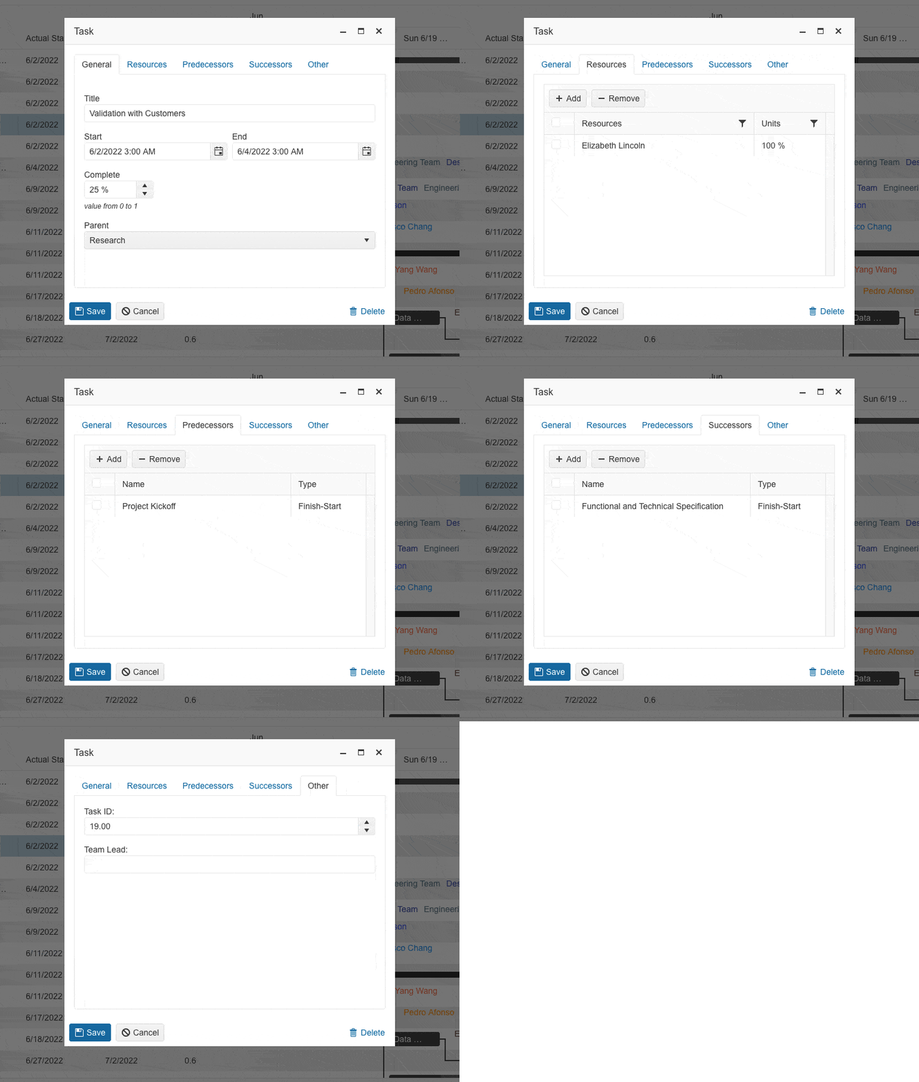
The built-in editing popup in Telerik UI for JSP Gantt Chart now displays five different tabs—General, Resources, Predecessors, Successors, Other—with editable task-related content. Empower users to effortlessly edit the task fields by providing them with a full-featured experience.
See the Telerik UI for JSP Gantt Chart editing demo
Enhancements in Telerik UI for JSP Editor's Table Wizard
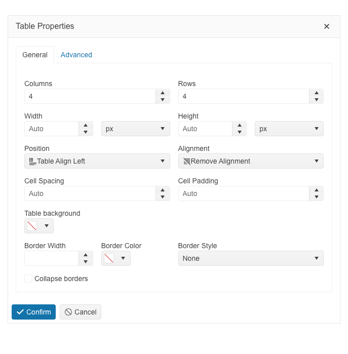
The table configuration wizard in the Telerik UI for JSP Editor component has been improved and reorganized into General and Advanced tabs for a more convenient user experience.
The General tab includes table, columns, rows and new granular cell properties, as well as a new table alignment configuration option that provides the possibility for tables to be positioned left, right or center. The Advanced tab of the editor table wizard exposes configurations for id and CSS, as well as accessibility settings for the table caption, header rows and columns.
The cell configuration dialog provides the possibility to configure cell width, height, margins, paddings, borders and more. Users also have a handy option through which they can apply the selected settings either to a specific cell or to all table cells.
See the Telerik UI for JSP Editor table wizard documentation
Substituting JSP Toolbars with the Kendo UI Toolbar
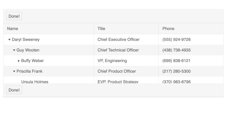
With R2 2023 the Telerik UI for JSP Toolbars are replaced with the Kendo UI ones, ensuring better appearance, enhanced consistency and overall elevated user experience with the components. The components where the Kendo UI Toolbars is now integrated are Editor, Grid, TreeList, Scheduler and Gantt.
See the Telerik UI for JSP TreeList demo for an example
Telerik UI for JSP StockChart Navigator: Position on Top
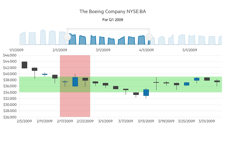
The Telerik UI for JSP StockChart component has been enhanced with a new property allowing you to position its navigator on top (in addition to the existing bottom position).
See the Telerik UI for JSP StockChart Navigator demo
Improved Telerik UI for JSP Forms Rendering
Fresh and modernized approach to forms rendering and layout is introduced in Telerik UI for JSP. With R2 2023, we have revamped the forms rendering and layout in multiple UI components, including the Data Grid, TreeList, Scheduler, DateTimePicker, and more.
Switching to Default SVG Icon Rendering in Telerik UI for JSP
With R1 2023, we introduced support for SVG icons along with the font icons, giving you more freedom to choose your icon format.
Up until now, the default icon type for Telerik UI for JSP themes was font. With R2 2023, however, we’re switching to SVG icon rendering to ensure better display, performance and security. Check out the blog post to learn more about the switch to SVG.
Telerik UI for JSP Demos are Enriched with Adaptive Behavior
Adaptiveness and responsiveness of the UI components for JSP has been on focus with the R2 2023 release. Along with the built-in settings we shipped, we also ensured to demonstrate the adaptiveness of the Autocomplete, ComboBox, DropDownList, DropDownTree, MultiColumnComboBox, MultiSelect, DateInput, TextBox, MaskedTextBox, NumericTextBox and TextArea components within our demos. Take a look at the mobile-friendly behavior of the components.
See the Telerik UI for JSP ComboBox demo for an example

UI for JSP
Telerik UI for JSP - R2 2023
- Improved Telerik UI for JSP Gantt Chart Editing Options
- Enhancements in Telerik UI for JSP Editor's Table Wizard
- Substituting JSP Toolbars with the Kendo UI Toolbar
- Telerik UI for JSP StockChart Navigator: Position on Top
- Improved Telerik UI for JSP Forms Rendering
- Switching to Default SVG Icon Rendering in Telerik UI for JSP
- Telerik UI for JSP Demos are Enriched with Adaptive Behavior
New features & Roadmap
Have a feature request?
Post your feedback via the JSP UI UserVoice portal or the Public forums
What's new across all Telerik products?
Next Steps
Try Telerik UI for JSP with dedicated technical support.
See the UI for JSP in action and check how much it can do out-of-the-box.
Check out the offers. Purchase an individual suite or treat yourself to one of our bundles.


